

Art, Science, and the COVID-Shortened 2020 Season
This article was written by Adam Korengold
This article was published in Fall 2022 Baseball Research Journal
Data visualization is an art. Alli Torban, a Washington, DC-based data visualization consultant, defines the art as a tool to “widen the circle of people who know what you know”—a truly apt description of the value of data visualization in an environment of information overload.1
Data visualization is also a science, using charts and graphs to supplement and clarify quantitative or qualitative information. Alberto Cairo, another leading writer and teacher of data visualization, defines this clarification element as “any kind of visual representation of information designed to enable communication, analysis, discovery, [and] exploration.”2
Baseball’s long history and devotion to record-keeping make it highly suitable for data visualization. More than any other sport, baseball has a remarkably rich and consistent body of statistical knowledge, dating as far back as 1869 with the Cincinnati Red Stockings, the first fully professional team that openly paid all its players.3
In comparison, the National Football League began in 1920, and the National Hockey League in 1917. While both those leagues have their own bodies of statistics, they are not nearly as extensive as the century and a half of data collected on professional baseball. The baseball database is robust enough that certain measures like wins above replacement (WAR) and on-base plus slugging average (OPS) can be calculated for players who were active decades before those measures came to be. At the same time, a review of baseball research shows a greater emphasis on creating mathematical and statistical models for assessing and predicting competitive results than on visualizing them.
While this statistical research is inherently valuable, for readers without statistical or quantitative backgrounds, the conclusions are less clear and understandable than they could be if presented in a compelling and visual way, as a supplement of—not a substitute for—the traditional tools of statistical analysis.
Baseball data have tended to be quantitative, beginning with the box score first developed in the 1840s and 50s for amateur players in the New York City area, with some efforts to improve on it to show the running score.4 Data visualization is also a tool for analyzing and presenting qualitative information and relationships, such as the development of the layout of the baseball diamond, in a way that adds a layer of visual and even literal interaction with the data.5 Most quantitative baseball research tends to focus on statistical insight and ranking, creating a need in today’s fast-moving visual media environment, to use data visualization to communicate, discuss, and share those insights more widely and with new audiences.
A WALK THROUGH THE DEVELOPING PRACTICE OF DATA VISUALIZATION
Data visualization offers a fundamentally unique way of seeing data generally, and baseball particularly, in a way that lends itself well to today’s highly visual environment. Visualizing data is an essential tool to make findings more accessible to audiences. While the practice may be new to some, it is not new, with antecedents that run from the most ancient ways of recording information up to the present day.
While the practice of data visualization is too broad in scope to discuss fully here, there are several types of visualizations, among many that are possible, that baseball researchers can (and in some instances have) used.6 Graphics standing for numbers are incredibly ancient. Tally sticks, with notches cut on bones to denote numbers, have been discovered in caves that are 30,000 or more years old. Cuneiform tablets nearly 5,000 years old account for barley harvests.7
More recently, the modern practice of data visualization began to appear in eighteenth and nineteenth century Europe, with the work of Edward Playfair, Charles Joseph Minard, and William Herschel. Playfair was arguably the first data visualizer, creating a collection of infographics that later became the Commercial and Political Atlas in 1785. This work would be easily recognizable today, showing international trade volumes, national accounts, and other economic data for European countries. (A Scot, Playfair focused his work on the United Kingdom and other European powers.)8
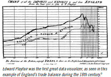
There is a direct line from Playfair’s “Linear Chronology, Exhibiting the Revenues, Expenditure, Debt, Price of Stocks, and Bread from 1770 to 1824” and Edward Tufte’s set of sparklines, or line graphs, showing the competitive landscape and pennant races across all six MLB divisions during the 2001 season.10 Line graphs are useful for showing progress over time; for example, whether batting averages or other measures have increased over a period or showing a team’s progress over a full season.
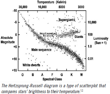
Mapping techniques are useful for showing where events occur. Geographical maps date from as long ago as 6200 B.C. in Turkey, but other types of mapping are useful for baseball research, in particular coordinate mapping that creates scatterplots mapped on two axes. Scatterplots are common across disciplines. Francis Galton, in 1874, used a correlation diagram (essentially a scatterplot) to show a relationship between head circumference and height in people whom he observed. Likewise, in astronomy, the Hertzsprung-Russell diagram plots the brightness of stars against their temperature for purposes of classification.11
In baseball, spray charts—a form of geographic mapping—show the parts of the field that players successfully reach with a batted ball. Similarly, in a 2019 study, the locations of fan injuries in major league baseball stadiums were mapped, resulting in MLB and the affiliated minor leagues expanding the use of protective netting in ballparks.13 Mapping data points along two dimensions in a scatterplot is also a useful way to show relationships between player statistics.
DATA VISUALIZATION IN PRACTICE FOR BASEBALL RESEARCH
We operate under a few assumptions. Firstly, the value of data visualization lies less in showing right or wrong answers and more in using visual tools to present that information and allow the audience to make sense of it. The goal is less about providing answers than guiding the questions to be asked. As such, a good data visualization can lead an audience towards a particular finding, but it can also highlight inconsistencies or details that are worth discussing.
Secondly, data visualization is tool-agnostic, meaning that similar principles apply no matter what tools are used to produce the visual. It is possible to create outstanding visuals using no more than a pencil and paper. This paper will not recommend any particular software application for data visualization, though we will mention a few. There are many available, both free via open source and through purchase or subscription. Depending on a researcher’s preferences and capabilities, a full toolbox of applications could include off-the-shelf packages like Microsoft Power BI, Qlik, or Tableau, or if one prefers coding tools, RStudio, Python, or many others. Tradeoffs exist between cost and usability out of the box; while open source applications like RStudio and Python are free, they require more time to learn and master.
This paper includes examples created in Tableau because it is widely available. The free version, Tableau Public, is a useful platform for building and sharing visualizations thanks to its availability as a free tool and relative ease of use, particularly for those who are not familiar with coding languages and tools like RStudio and Python.
Finally, a note about color. Modern data visualizations are often designed to be shown and interacted with in full color on computer screens. In published journals, where black and white or greyscale are needed, similar principles apply where gradations of black and white are valuable for showing differences. The visualizations in this paper appear in black and white.14
A BASEBALL CASE STUDY: WAS THE 2020 MLB SEASON AN OUTLIER?
For the case example, the first step defines the problem to be addressed and the story to tell. The most effective visualizations include a narrative, which can be as simple as a situation/action/result framework. What was the situation that existed, what did the research or analysis try to show, and what were the conclusions or outcomes? Ideally, data visualization exists not for its own sake, but rather aims to show an insight or finding that can be a basis for discussion, action, or further analysis.
In this case, the visualization focuses on the 2020 baseball season, which was limited to 60 games due to the COVID-19 pandemic. The normal spring training period was cut off in mid-March and resumed in abbreviated fashion for a July 23 regular season start. As a result of the truncated spring training and season, researchers could wonder if the offensive results and records set during the short 2020 season were in line with recent seasons. The focus for this analysis is therefore on the five most recent seasons, from 2017 through 2021, including the 2020 campaign.
METHODOLOGY
Tableau Public, as described above, was chosen as the application for this analysis. The data source is Stathead, a searchable online archive of baseball statistics served by Sports Reference.15 Key offensive statistics including hits (H), home runs (HR), on base average (OBP), and slugging average (SLG) were collected for batters qualifying for batting titles during the 2017 through 2021 Major League Baseball seasons. (Qualifying batters were defined per MLB standards as logging a minimum of 3.1 plate appearances per team game, or 502 for the 2017–19 and 2021 seasons and 186 for the 2020 season.) Data were selected for the parameters above, exported into a .csv file, saved as a Google Sheets file, and imported into Tableau Public using the application’s proprietary Google data import tool.
ANALYSIS
The next steps will show whether the 2020 season was in fact different from the other four, using statistical analysis but also using data visualization to clarify and contextualize these points, and set up a basis for discussion. Two scatterplots will each plot two pairs of key offensive statistics against each other. The first pair are hits versus home runs, which are two “counting” statistics that are clearly changed by the length of the season, and the second pair are OPS and SLG, which are “rate” statistics that are more easily comparable across normal seasons, but a shorter season like 2020 will likely produce more outliers.
The analysis begins with a simple scatterplot showing hits (on the x axis) versus home runs (on the y axis). Each data point stands for a single season between 2017 and 2021 for a qualified batter. Figure 1 shows the average figures, and the 95 percent confidence interval, through the dark grey line and light grey shading, respectively.
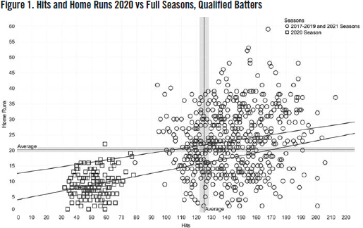
The ”constellation” of squares in the lower left-hand corner represents the 2020 season, with substantially lower hit and home run totals. In that season, hits totaled from 32 to 79, compared to between 95 and 213 hits for the other analyzed seasons. Home runs totaled between 8 and 22 for 2020, and 4 and 59 for the other years. The trend lines in the same shades as the data points illustrate the linear regressions describing the model. They will also be analyzed statistically, but for purposes of the data visualization, it is useful to note that the lines are of different slopes, and different y-intercepts, lower for the 2020 season than the other four. This finding is not surprising, since the season was only about one third the length of a typical one.
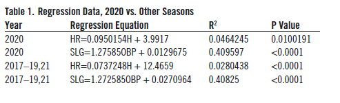
Turning to the OBP versus SLG analysis (Figure 2), the scatterplot featuring OBP on the X axis and SLG on the Y axis is below. This analysis shows even more interesting findings: a convergence of all the data points around a single origin, and virtually identical regression lines.
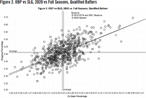
It’s interesting to note that the most extreme data points–at the high and low ends of the X and Y axes–are for the 2020 season, which accounts for greater variability across a smaller number of games. When one analyzes the data statistically, the regression line, R2 measure (which shows the degree of variability accounted for by the model, and the P value (which shows the statistical significance) are in Table 1.
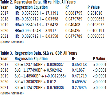
For hits and home runs (Figure 3), the analysis shows that there is not much of a relationship between the 2020 season and the others. The R2 values are small, less than 0.05 and 0.03 for the 2020 and other seasons, suggesting that the simple regression model does not account for much of the variability between hits and home runs. (The P values, however, do show that the findings are statistically significant, especially in the case of the other four years.)
For on-base and slugging averages, these data indicate that the seasons are similar, if not virtually identical. The slopes are within 0.003 of each other, the intercepts within 0.15 of each other, and the R2 are both nearly 0.41. Again, looking at the visualization itself is insightful, because it shows how aligned the two sets of statistics are.
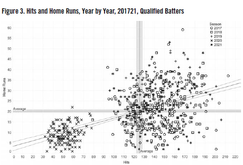
Finally, the power of the data visualization comes through in Figure 3 when it is edited to show each year in succession, denoted by data points represented by different shapes for each season between 2017 and 2021, for hits versus home runs and OBP versus SLG respectively. The charts are slightly more complex, but further show that, particularly for averages, the 2020 season was not significantly different from the other four between 2017 and 2021.
Rather than show a regression line for each season in the chart above, for clarity and simplicity, only the overall regression line is shown, along with the 95 percent confidence interval. For the seasonal analysis, the linear regressions, R2 values, and P values for each season are shown in Tables 2 and 3.
From the visualizations, in terms of absolute statistics (hits and home runs), 2020 was an outlier for the fact of its much shorter length, which is intuitive. More comforting, given baseball’s interest in keeping the game’s essential elements, the analysis of important averages like OBP and SLG seem to show that despite the season’s unusually short length, batters achieved the expected level of excellence in 2020. The visualization shows that those elements of performance were consistent with other recent seasons.
In data visualization, the ability to see those similarities or differences, in a way that can’t be intuited merely from reading the numbers, is an important feature. The individual numbers are of course still there: much as a fan can pore over numbers or pull old baseball cards from a deck, a researcher can examine the visualization online and mouse over each data point to see which players they stand for, including the relevant statistics for each player, the teams that they played on—or examine the regression lines to see the data for themselves.
SUGGESTIONS FOR INCORPORATING DATA VISUALIZATION INTO BASEBALL RESEARCH PRACTICE
This paper is meant as the beginning, not the end, of a discussion on how to incorporate principles of data visualization into baseball research. Further, the author’s intention is not to be proscriptive about the kinds of ideas or visual forms to use, but rather to encourage baseball researchers to include visualizations as part of their ongoing work to analyze, predict, categorize, and suggest developments in the analysis of baseball.
Visualization is both the first and last mile of research. At the beginning of a research project, it can help the researcher identify and prioritize truly relevant or interesting areas to examine more closely. At the end of the process, through effective visuals, the researcher can make a set of findings relevant, clear, and understandable for an audience that is unfamiliar with statistics or quantitative research. In today’s digital and visually rich research environment, a tremendous volume of ideas can be shared on online platforms and through social media. In a world where a tweet can only hold a maximum of 280 characters, visuals become essential.
Further, using an interactive visual—where the reader or viewer may interact with multilayered data, choosing and analyzing specific data points—gives readers a personal experience with the information that they are absorbing. The data become more relatable and actionable, and easier to share across disciplines. Most essentially, the value lies in communicating and interacting with others about research findings; not so much to prove right or wrong answers, but to encourage exploration of the data and spur discussion to its own end.
ADAM KORENGOLD has been a SABR member since 2020. He is a research and data visualization analyst, manager, and teacher. He is an Analytics Lead at the National Library of Medicine in Bethesda, Maryland, and an adjunct professor of data visualization in the graduate open studies program at the Maryland Institute College of Art in Baltimore, Maryland. He has also presented on the relationship between baseball card design and contemporary art and design trends to SABR chapters.
Notes
1. Alli Torban Design Home Page, www.allitorban.com (Accessed January 2, 2022).
2. Alberto Cairo, The Truthful Art (San Francisco: New Riders, 2016), 28.
3. Howard Wilkinson, “The 1869 Cincinnati Red Stockings: The Team that ‘Made Baseball Famous,’” WXVU Radio, Cincinnati, OH, February 22, 2019 (accessed January 8, 2022): https://www.wvxu.org/sports/2019-02-22/the-1869-red-stockings-the-team-that-made-baseball-famous.
4. Edward Tufte, Seeing with Fresh Eyes: Meaning Space Data Truth (Cheshire, Connecticut; Graphics Press, 2020),
5. Tom Shieber, “The Evolution of the Baseball Diamond: Perfection Came Slowly,” SABR 50 At 50: The Society for American Baseball Research’s Fifty Most Essential Contributions to the Game (Lincoln, Nebraska: University of Nebraska Press, 2020), 186–206.
6. Anna and Mark Vital, The Visualization Universe, at www.visualizatio-nuniverse.com (Accessed January 1, 2022).
7. Michael Friendly and Howard Wainer. A History of Data Visualization & Graphic Communication (Cambridge: Harvard University Press, 2021), 11–13.
8. Murray Dick, The Infographic: A History of Data Graphics in News and Communications (Cambridge: The MIT Press, 2020), 44–55.
9. Sachs, Jonathan. “1786/1801: William Playfair, Statistical Graphics, and the Meaning of an Event.” BranchCollective.org (accessed October 14, 2022).
10. Edward Tufte, The Visual Display of Quantitative Information 2nd ed., Chesire, CT, Graphics Press, 2001), 174.
11. Friendly and Wainer, 121–58.
12. “Pulsating Variable Stars and the Hertzsprung-Russell (H-R) Diagram.) Chandra X-Ray Observatory, (accessed October 15, 2022): https://chandra.harvard.edu/edu/formal/variable_stars/bg_info.html.
13. Michelle Tak et.al. “Foul balls hurt hundreds of fans at MLB ballparks. See where your team stands on netting.” NBC News, https://www.nbcnews.com/news/sports/we-re-going-need-bigger-net-foul-balls-hurt-hundreds-n1060291, October 1, 2019 (accessed January 1, 2022).
14. As mentioned in the text, Tableau Public is a free tool produced by Tableau, a division of Salesforce.com and available at www.public.tableau.com. To view the visualizations in this paper, visit https://public.tableau.com/app/profile/adam.s.korengold/viz/Wasthe2020SeasonUnusualGreyscale/Figure3HitsandHomeRunsYearByYear2017-2021QualifiedBatters.
15. Stathead Baseball, https://stathead.com/baseball/season_finder.cgi?type=b (Accessed December 26, 2021).