Baseball, Hot Dogs, and ToxPi: An Approach for Visualizing Player Performance Metrics
This article was written by Stephen D. Dertinger - Benjamin J. Dertinger
This article was published in Spring 2022 Baseball Research Journal
Major League Baseball (MLB) is awash in advanced metrics that more reliably describe key aspects of players’ offensive and defensive performance compared to “traditional” statistics. PITCHf/x and Statcast greatly contributed to this. The power of the original Statcast system came from its effective integration of high-definition video cameras and Doppler radar.1 Whereas cameras were useful for following player movement, the radar system’s strong suit was tracking the baseball, including velocity off the bat, spin rate, and myriad other metrics that had previously resisted accurate quantification. The second-generation Statcast technology was put into operation in 2020, and it employs 12 high-resolution and high-frame-rate video cameras to detect and track player and ball movement. (For more information about the hardware and software components of the updated system, interested readers are directed to a review by Ben Jedlovec.2)
It has been reported that even the first-generation Statcast system was capable of supplying teams with 70 fields times 1.5 billion rows of data per season.3 Yes, a billion with a b! This flood of information has supercharged MLB teams’ and the sabermetric community’s development of ever-more useful statistics for describing player performance. However, this amount of data brings significant challenges. Perhaps chief among them is the ever-growing number of player performance metrics that have become lost in a sea of impenetrable tables. For example, at the time of this writing, the FanGraphs website provides MLB position players’ statistics across 20 tables.4
Overreliance on numerous, dense tables is a recognized problem that fosters inaction. This has been elegantly described by Professor David Olusoga and Dr. Steven Johnson in the BBC television special Extra Life: A Short History of Living Longer.5 They presented the case of physician Ignaz Semmelweis, whose investigation revealed that death among women giving birth plummeted when doctors washed their hands before assisting with delivery. Tragically, Dr. Semmelweis’s findings languished for decades in dense, inelegant tables that failed to influence his Venetian colleagues. The BBC special’s counterpoint was Florence Nightingale. Nightingale’s mid-1850s data indicated unsanitary conditions at Crimean War field hospitals and consequential infections were responsible for the vast majority of fatalities. Her body of work rapidly transformed hospital practices, and saved untold thousands of lives in her lifetime. Professor Olusoga and Dr. Johnson credited the rapidity and remarkable progress in preventable deaths to the information Nightingale presented as visually arresting graphics that became known as Rose Diagrams.
Addressing MLB’s data deluge and overreliance on tables of numbers is obviously not of the same import as the life-saving work described above. That said, the same lesson applies: potentially actionable information is more likely put to use when it is freed from tables and transformed into readily interpretable visuals.6
When contemplating MLB’s data volume and visualization challenges, it occurred to us that there are certain similarities to the discipline of safety toxicology, where the use of high-information content assays for characterizing chemicals’ toxicological profiles has exploded.7 Interestingly enough, one tool that toxicologists have turned to has a certain family resemblance to Florence Nightingale’s Rose Diagram: the Toxicological Prioritization Index, or ToxPi for short.8 ToxPi is an analytical software package that combines multiple sources of evidence by transforming data into integrated, visual profiles.
The ToxPi interface is based on a Java-executable script that is freely available at http://toxpi.org. (A version based on the R statistical programing language became available in February 2022, and can be found at the same site.) In addition to the main Java script, the single, compressed download includes a user manual, all libraries, and example data files. Visually, ToxPi is represented as component slices of a unit circle, with each slice representing one piece of information. For each slice, distance from the center is proportional to a user-defined metric (in our use case, some performance statistic), and the width indicates the relative weight of that metric in an overall ToxPi score calculation. Figure 1 shows two prototypical profiles and is provided to familiarize readers with the basic ToxPi structure. Besides the software’s ability to distill complex statistics into informative summary graphics, it provides quantitative results in the form of slice scores, which corresponds to an individual performance metrics, and an aggregate ToxPi score, which represents the normalized sum of the slice scores.
Toxicologists have found that the ToxPi program has several compelling features that make it ideal for communicating results to wide audiences: ability to incorporate diverse data types into one integrated model; ability to easily share models and add new data; capacity for differential weighing of factors; quantitative analyses that are accompanied by informative graphics; transparency in score derivation and graphing; dynamic data exploration; depiction of model uncertainty in the form of 95% confidence intervals; and extreme flexibility.
Taking advantage of the platform’s flexibility, this paper describes the repurposing of ToxPi software to synthesize multiple MLB player performance metrics into summary graphics and statistics. Over the following pages several illustrative case studies are provided: i) a model that describes Bryce Harper’s offensive and defensive skills over several consecutive years; ii) a comparison of 24 position players over the seasons 2016-19; iii) an analysis that models Mike Trout’s splits with respect to pitch type; and iv) multifactorial pitcher models that highlight a useful data transformation step as well as an alternative factor-weighting technique. These are not intended to be definitive analyses and do not represent the only ToxPi use cases. Rather, these examples are offered to introduce the sabermetrics community and other stakeholders to the flexibility and merits of this simple but powerful data synthesis and visualization platform.
METHODS
The Methods section is provided to support data analysts that are interested in applying ToxPi analyses to their own research. Casual readers may wish to skip to the Results and Discussion section.
ToxPi Score, Slice Score
There are two key quantitative metrics associated with each ToxPi profile: slice scores and an overall ToxPi score. To obtain slice scores, player performance metrics (e.g., batting average, on-base percentage, etc.) are summed for each player, then normalized to the interval zero to one by dividing each player result by the slice maximum across all players. Values closer to the maximum translate to higher performance relative to all other players, whereas values closer to the origin (equal to 0) translate to poorer performance. The overall ToxPi score is the sum of each slice, which is also rescaled to the interval zero to one in order to facilitate score interpretation across different models.
Data
All data are from Fangraphs. A list of Fangraph-sourced statistics and their abbreviations follow:
- AVG: batting average.
- ERA-: ERA minus is a park-and league-adjusted version of earned run average. League average is 100, and each point above or below 100 is one percentage point better or worse than league average.
- BABIP: batting average on balls in play.
- BsR: base-running runs above average. This statistic converts stolen bases, caught stealing, and other base-running plays into runs above and below average.
- FIP- : FIP minus is the park-and league-adjusted version of fielding independent pitching. This statistic estimates a pitcher’s run prevention independent of the performance of their defense. League average is 100, and each point above or below 100 is one percentage point better or worse than league average.
- Innings: innings pitched in a given season.
- K%: strikeout rate, how often a hitter strikes out on a per-plate-appearance basis.
- K/BB: strikeout-to-walk ratio, a measure of a pitcher’s ability to control pitches.
- OBP: on-base percentage, a measure of how frequently a batter reaches base.
- SLG: slugging, represents the total number of bases a player records per at-bat.
- UZR/150: ultimate zone rating, a comprehensive defensive statistic that puts a run value to defense; 150 signifies UZR has been scaled to 150 games.
- WAR : wins above replacement. This statistic summarizes a player’s total contributions to their team in one value, and represents a useful reference point for comparing players.
- WHIP: walks plus hits per innings pitched, measures how many baserunners a pitcher allows per inning.
- wRAA: weighted runs above average, measures the number of offensive runs a player contributes to their team compared to the average player. A wRAA of zero is league-average, so a positive wRAA value denotes above-average performance and a negative wRAA denotes below-average performance.
The ToxPi user manual describes data file formatting requirements. Therefore, we will only briefly describe our file structures for the work described herein. All analyses used season-level statistics and were entered into Microsoft Excel for Mac (v16.16.14). In order for ToxPi to recognize the files, they were exported as comma separated value (csv) files. For the purpose of this presentation, we will refer to one data-entry format as time series. For time series models, a single column was used to record player and season information (e.g., Bryce Harper 2015, Bryce Harper 2016, etc.). Other columns were used for each of the statistics included in the model (e.g., wRAA, BsR, etc.). In this manner, each row captured a different season’s worth of statistics. This format allowed us to assign one statistic to a unique ToxPi slice. These time series-formatted files were used to create one ToxPi profile for each year studied.
We refer to a second data-entry format as interplayer comparison. For this type of model, one column was used to record the player name (e.g., Mookie Betts, Mike Trout, etc.), and one column was dedicated to each statistic/year combination studied (e.g., wRAA 2015, BsR 2015, wRAA 2016, BsR 2016, etc.). Each row therefore captured an individual player’s statistics over multiple years. This format allowed us to assign multiple years of one statistic to a unique ToxPi slice, and thereby generate one ToxPi profile for each player studied, summarized across the specified years. Note that several position players contributed less than 72 games during 2016 (e.g., Aaron Judge), and in these cases that season was not studied.
ToxPi requires non-negative numbers. Therefore, some statistics such as BsR, wRAA, and UZR/150 required offsets. In Excel, before creating a csv file for uploading into ToxPi, seven was added to each BsR value, and twenty was added to each wRAA and UZR/150 value.
Regardless of the format used, once a csv file was uploaded into the ToxPi program, statistics were assigned to particular slices and then repositioned, given different weights, and assigned a shade of grey (for the printed journal) or a unique color (for electronic versions of the article). The resulting models were exported as new csv files which encoded these choices so they did not have to be re-specified when new data were entered.
We appreciate that the data-formatting descriptions may be somewhat abstract to readers that do not have experience running Java-executable scripts. That being said, we can attest that ToxPi is a very user-friendly interface, and data formatting becomes intuitive after a short period of first-hand experience. For readers interested in learning more about ToxPi, we will make the files and models used herein available upon request.
ToxPi Analyses: Position Player Comparisons
Three comprehensive statistics were used to evaluate 24 position players’ performance over the years 2016-19: BsR, wRAA, and UZR/150. After exploring several approaches for assigning weighting factors, we achieved adequate performance for the purpose of demonstrating ToxPi’s main features by considering the relationship between players’ WAR values vs corresponding years’ BsR, wRAA, and UZR/150 values. Specifically, three coefficient of determination (RA2) values for 24 players were calculated: WAR vs BsR, WAR vs wRAA, and WAR vs UZR/150. The WAR vs wRAA RA2 value was approximately eightfold higher than the other two coefficients, and it was this relative relationship to WAR that formed the basis of the ToxPi weighting. Thus, BsR, wRAA, and UZR/150-associated RA2 values became ToxPi weighting factors of 10%, 80%, and 10%, respectively. The inter-player comparison file format described above was used, and the resulting model allowed us to generate a ToxPi profile for each player that summarized performance for the three or four years studied.
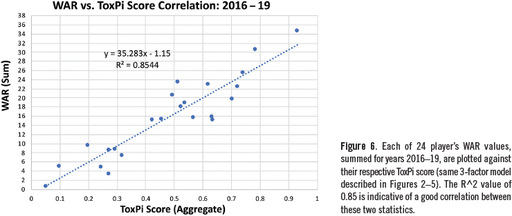
To evaluate the performance of the three-factor model, a metric was needed to represent ground truth. We chose WAR, summed over the four-year period under study. We plotted each player’s WAR value against their corresponding ToxPi score, and the RA2 value was calculated with Excel. This statistic was used to assess how closely the three-factor ToxPi model correlated with WAR and, by extension, how well the model performed.
ToxPi Analyses: Bryce Harper Time Series
The same three-factor model described above (BsR, wRAA, and UZR/150 weighted at 10%, 80%, and 10%, respectively) was used to evaluate Bryce Harper’s performance over four consecutive years, 2016-19. In this case, we used the time series-type format. Executing this model allowed us to generate a ToxPi profile for each of four years under consideration. In combination with Bryce Harper results from the inter-player comparison format described above, this example highlights the ability of ToxPi to depict results on a per-season basis, as well as summarized results across multiple years.
ToxPi Analyses: Mike Trout Pitch-Type Splits
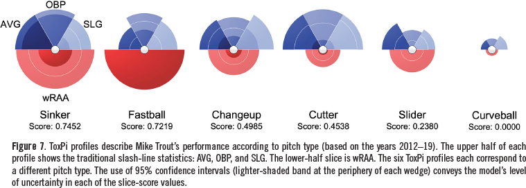
A four-factor ToxPi model was built to study Mike Trout’s performance against six pitch types over eight years, 2012-19. Three metrics were the slash line statistics: AVG, OBP, and SLG. The fourth metric was the comprehensive offensive statistic wRAA. We weighted each of the slash-line statistics at 16.67%, and wRAA at 50%. Rather than generating a ToxPi profile for each year and each pitch type (six pitches x eight years = 48 profiles), we included each of the season’s statistics into the four ToxPi slices. This is analogous to the interplayer comparison format described above, but with a different pitch type appearing in each row instead of a different player. Given this format, ToxPi distilled the number of profiles down to six, one per pitch type, summarized across eight years.
ToxPi Analyses: Pitcher Comparisons
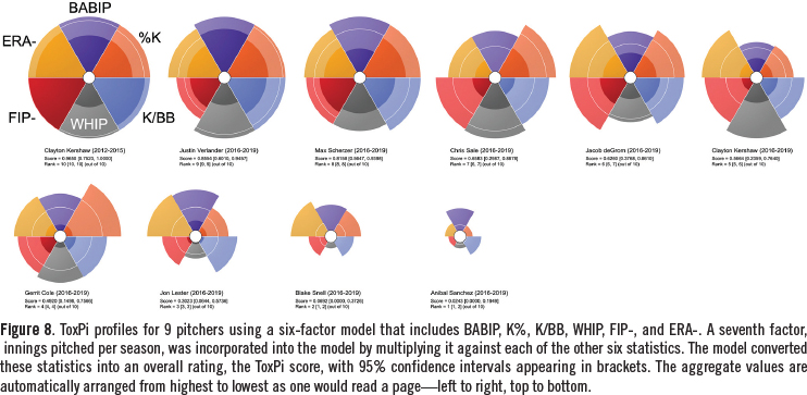
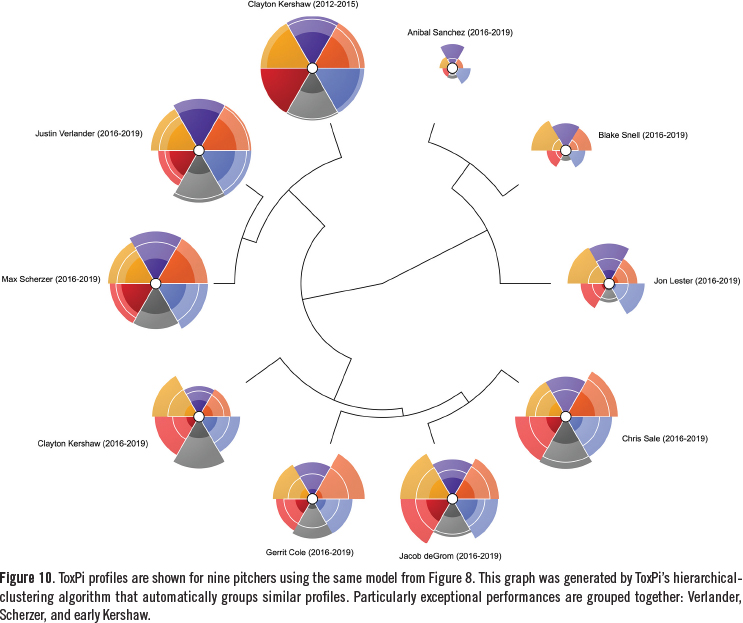
A seven-factor ToxPi model was built to study nine different pitchers’ performances over the years 2016-19. One pitcher was represented a second time, over an earlier four-year span (i.e., Clayton Kershaw’s historically great performance from 2012-2015 was added as an interesting frame of reference). Six statistics included in the model were: WHIP, ERA-, FIP-, BABIP, K%, and K/BB, which were all weighted equally. A seventh statistic, innings, was incorporated in an alternate manner: Each of the six aforementioned metrics was multiplied by the corresponding year’s innings value.
To conduct these analyses, data were entered according to the previously described inter-player comparison format. This model was not constructed to produce a ToxPi profile for each year and each pitcher (four years x 10 pitcher comparisons = 40 profiles). Rather, ToxPi distilled the number of profiles down to 10, one per pitcher, summarized across four years.
Pitcher performance modeling provided an opportunity to highlight an important data transformation requirement. Specifically, whenever a statistic signifies better performance with a lower value as opposed to a greater value, a data transformation step is required. Therefore, for the statistics WHIP, ERA-, FIP-, and BABIP we used a reciprocal transformation (e.g., 1/WHIP, etc.).
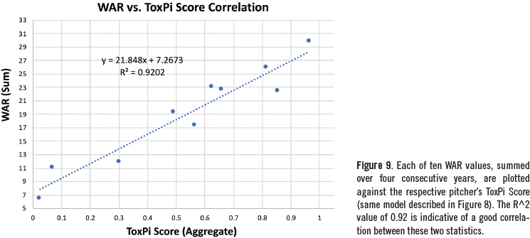
To evaluate the performance of the model, a ground truth-type metric was required. As with the position player models, we used the sum of WAR for the years under consideration. The RA2 value was used to assess how closely the ToxPi model correlated with WAR.
RESULTS AND DISCUSSION
Bryce Harper time series
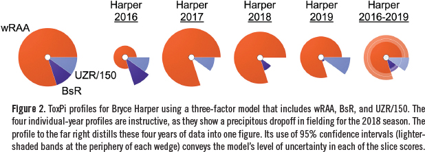
ToxPi profiles that describe Bryce Harper’s overall performance over the years 2016-19 are shown in Figure 2. ToxPi scores for these years were 0.4455, 0.8769, 0.7425, and 0.6508, respectively.
The graphic representations of the four individual years are instructive, as they show a precipitous dropoff in fielding for the 2018 season. The profile to the far right concisely synthesizes these four years of play into one information-rich figure. While in some respects the four-year view lacks some of the granularity of individual-year profiles, one can appreciate its advantages for research questions that involve many players over numerous years. The aggregate image also provides us with the opportunity to showcase a key advantage of ToxPi, that is, its ability to convey model uncertainty in the form of 95% confidence intervals (i.e., the lighter-shaded bands at the periphery of each wedge). In the current Harper example, the wide UZR/150 confidence interval emphasizes the large variation in defensive performance over the four years under consideration. While this was apparent across the four individual per season profiles, it is more efficiently conveyed in the single figure that includes confidence intervals.
Position Player Comparisons
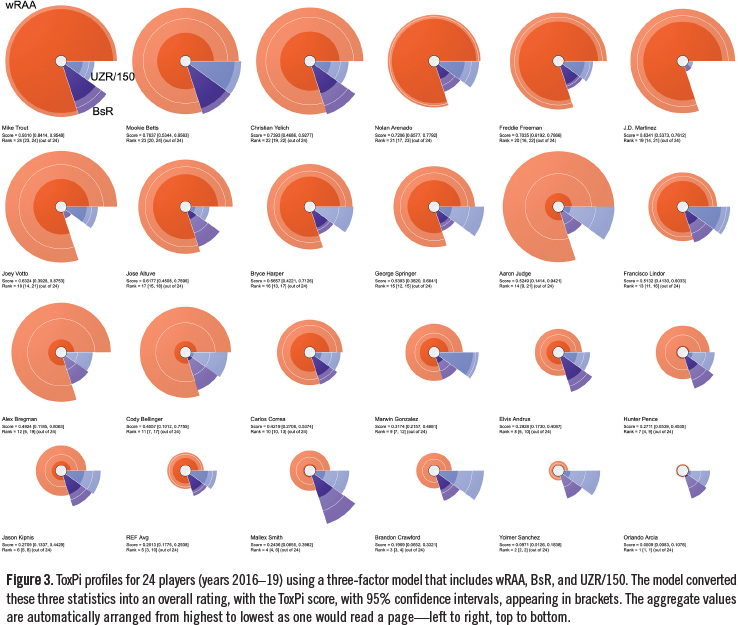
ToxPi profiles from a three-factor model that describes position player’s overall performance over the years 2016-19 are shown in Figure 3. These results are for 24 players with a wide range of abilities, from below average to exceptional. A league average profile is included for reference. This figure illustrates one of ToxPi software’s graphical output options, where the highest overall score appears in the upper left, and successively lower scores continue in a left-to-right, top-to-bottom manner. Along with the graphical results, it is possible to include ToxPi scores with confidence intervals (as done here), as well as individual slice scores (not shown).
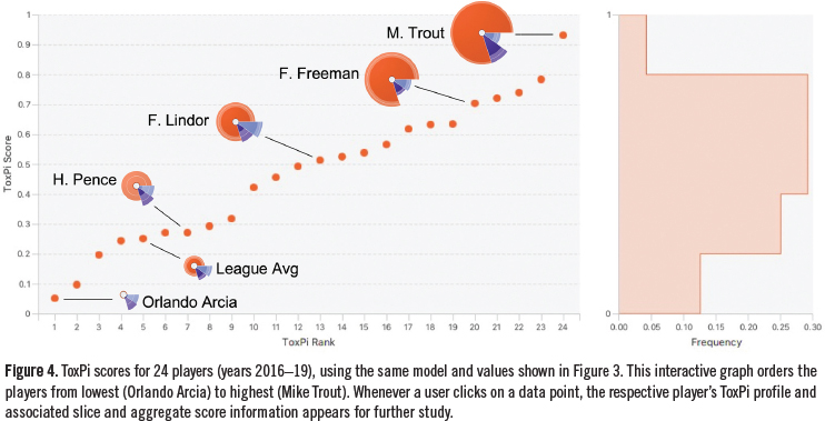
A second graphical output option is shown by Figure 4. Here, each ToxPi score is plotted against the corresponding rank-order value. This illustrates the continuous nature of the scores, and provides an interactive view of the player data. That is, when data points are selected on the graph, the appropriate ToxPi images are shown, along with associated quantitative data.
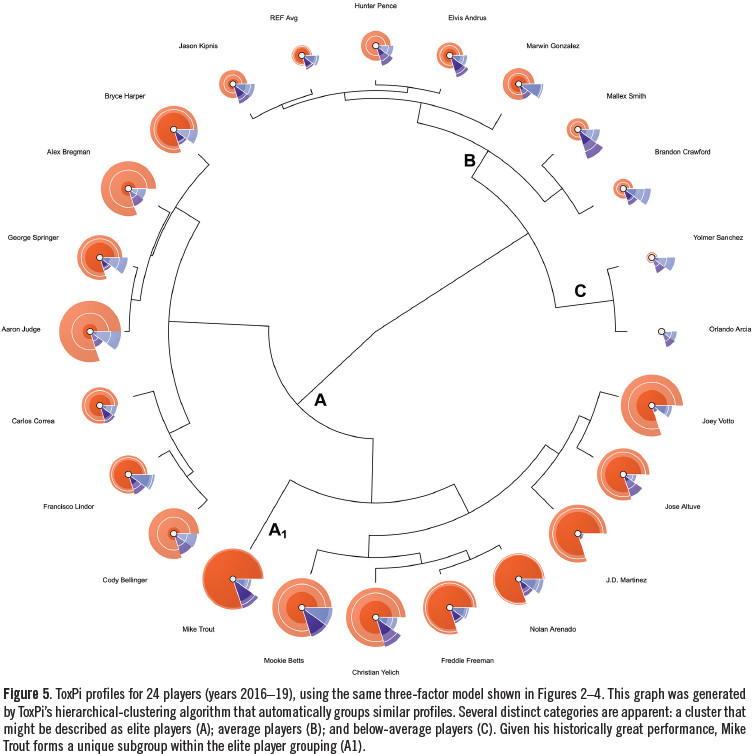
A third graphical output option is shown by Figure 5. Here, we made use of ToxPi’s unsupervised hierarchical clustering algorithm, which automatically groups similar profiles. This powerful analysis makes several distinct categories apparent: a group of elite, average, and below-average players. Note that these high-level descriptions do not capture all the information that is generated by the clustering algorithm. For instance, given his historically great performance over the years 2015-19, Mike Trout forms a unique subgroup within the elite player grouping (denoted by “A1” in Figure 5).
In an effort to objectively evaluate the reliability of our provisional three-factor model, we compared ToxPi scores to respective WAR values (Figure 6). The resulting RA2 value of 0.85 suggests that the ToxPi model is working, at least to a first approximation. While there is certainly room for improvement, these results suggest the current modeling is sufficiently reliable for demonstrating the ToxPi platform’s attributes and capabilities.
Mike Trout Pitch-type Splits
Figure 7 shows ToxPi output describing Mike Trout’s performance according to pitch type based on the 2012-19 seasons. Here, as elsewhere, whenever slices summarize results over multiple years, we chose to show confidence intervals. This provides an indication of model uncertainty, which translates to variability in a player’s performance. Whether one considers the slash-line statistics or the advanced wRAA metric, this modeling exercise suggests that even the game’s premier hitter has some room for improvement—less so for fastballs, more so for breaking balls.
Pitcher Comparisons
ToxPi profiles from a seven-factor model that describes pitcher’s overall performance over the years 2016-19 (and 2012-15 in the case of Clayton Kershaw) are shown in Figure 8. These results are for 9 players with a wide range of abilities, from average to multiple-year Cy Young winners.
Among other things, this figure shows how remarkable Clayton Kershaw’s 2012-15 seasons were, with dominating performances across each of the metrics studied. Recall that we multiplied each of the six statistics by innings. This resulted in a higher correlation to WAR values (RA2 = 0.92, Figure 9) compared to a model that included innings as a seventh-slice metric instead of a multiplier (RA2 = 0.81). Of course, using innings as a multiplier had the effect of increasing the overall score for pitchers who regularly contributed high numbers of innings per season, like Justin Verlander; conversely, it penalized a pitcher like Blake Snell, who was utilized quite differently by his team (i.e., much briefer outings).
Hierarchical clustering results are shown by Figure 10. This provides an opportunity to discuss an important advantage of the ToxPi platform. It is easy, and indeed human nature, to interpret graphics and point-estimate scores, such as those presented in Figure 9 as highly accurate and precise depictions of rank order: early Kershaw (ToxPi score 0.9650) is superior to Verlander (0.8554), which is superior to Scherzer (0.8158). However, it is more appropriate to consider modeling results such as these with measures of uncertainty in mind. For instance, in the context of confidence intervals, the hierarchical clustering algorithm and associated graphics are helpful in this regard. In the current example, it places Kershaw, Verlander, and Scherzer in the same group; meaning, their performances were distinctly superior to the other pitchers. On the other hand, assessments about rank order within this group of three should be made with caution, and appropriately qualified.
CONCLUSIONS
ToxPi is an analytical software package that is useful for combining multiple types and sources of data into integrated, visual profiles. There are two key characteristics of the software that we found particularly useful when applied to MLB statistics. First, the platform allowed us to easily synthesize disparate data into high-information content images. While WAR and other summary-type metrics are certainly valuable, they are not transparent. When WAR values are discussed, it is not obvious which aspect(s) of a player’s performance are contributing and detracting from the numerical score. On the other hand, when one studies player performance with ToxPi software, the aggregate scores are always accompanied by visuals that convey information about each component of the underlying model. For instance, our example with 24 position players clearly showed that Mookie Betts’s high ToxPi score is attributable to stellar performance across hitting, fielding, and baserunning. Conversely, his teammate at the time, J.D. Martinez, exhibited a high aggregate score that was strictly attributable to hitting prowess. We suspect that many teams’ front-office personnel, fans, and other stakeholders would benefit from this level of granularity.
A second key feature of ToxPi is that it has a mechanism for conveying model uncertainty into the graphical and numerical output. This is important, as it helps guard against human nature, which tends to interpret point estimates and player rankings as accurate and precise to the many decimal points provided by the algorithms. This is an erroneous way to interpret results, and models such as ToxPi that provide confidence intervals or other indications of uncertainty help guard against these temptations to over-interpret results.
In summary, we have showcased key advantages of using the ToxPi software platform to convert MLB player-performance metrics into integrated models. We contend that moving data out of dense tables and into dynamic data exploration platform(s) such as ToxPi will facilitate the acquisition of actionable insights. In the future, we hope to read about new, interesting analyses sports analysts accomplish with this versatile data synthesis and visualization tool.
BENJAMIN J. DERTINGER is a third-year year college student at High Point University where he is a three-season track athlete. He is a majoring in business administration and this baseball statistics project encouraged him to pursue a minor in data analytics. Ben is looking forward to fielding questions and receiving suggestions about his research at bdertinger@gmail.com.
STEPHEN D. DERTINGER is director of research at Litron Laboratories, a company that specializes in genetic toxicology. His day job has taught him the importance of synthesizing multifactorial data into readily-interpretable visuals that include information about uncertainty. Steve is looking forward to fielding questions and receiving suggestions about his research at sderting@rochester.rr.com.
Acknowledgements
This work benefited from countless conversations and advice from MLB-loving family and friends, especially Bill Dertinger, Jeff Travis, Scott and Maria Engel, Chuck Korb, Jack Falter, and John Filippini. Thank you all!
Notes
1. “Statcast,” Wikipedia, accessed March 27, 2022. https://en.wikipedia.org/ wiki/Statcast.
2. Ben Jedlovec, “Introducing Statcast 2020: Hawk-Eye and Google Cloud,” MLB.com, July 20, 2020, accessed March 27, 2022. https://technology.mlblogs.com/introducingstatcast-2020-hawk-eye-and-google-cloud-a5f5c20321b8.
3. Keith Law, Smart Baseball (New York: Harper Collins Publishers, 2017).
4. “Mike Trout,” FanGraphs, accessed March 27, 2022. https://www.fangraphs.com/players/mike-trout/10155/stats?position=OF.
5. Harry Howard, “The chart that made Florence Nightingale a heroine: How British nurse’s ‘Rose diagram’ on hospital hygiene changed history…while Hungarian medic’s confusing tables made him a laughing stock,” DailyMail.com, June 8, 2021, accessed March 27, 2022. https://www.dailymail.co.uk/news/article-9663703/Documentary-sheds-light-Florence-Nightingales-Rose-Diagram.html.
6. Edward R. Tufte, The Visual Display of Quantitative Information (Cheshire, Connecticut: Graphics Press, 2nd edition, 2001).
7. Stephen D. Dertinger, Yukari Totsuka, Jason H. Bielas, Ann T. Doherty, Jos Kleinjans, Masamitu Honma, Francesco Marchetti, Maik J. Schuler, Veronique Thybaud, Paul White, and Carole L. Yauk, “High information content assays for genetic toxicology testing: A report of the International Workshops on Genotoxicity Testing (IWGT),” Mutation Research847 (2019) 403022.
8. Skylar W. Marvel, Kimberly To, Fabian A. Grimm, Fred A. Wright, Ivan Rusyn, and David M. Reif, “ToxPi Graphical User Interface 2.0: Dynamic exploration, visualization, and sharing of integrated data models,” BMC Bioinformatics 19 (2018) 80.


