

Graphing Cumulative Rate Statistics
This article was written by Alex Reisner
This article was published in Fall 2009 Baseball Research Journal
“No doubt some graphics do distort the underlying data, making it hard for the viewer to learn the truth. But data graphics are no different from words in this regard, for any means of communication can be used to deceive.” — Edward Tufte, The Visual Display of Quantitative Information
Data-visualization expert Edward Tufte suggests that graphs can deceive as easily as words. While that is certainly true, this article is not about intentional deception. Rather, it’s about graphics that have deceived their very authors. These graphs do not illustrate their purported subject because they are unwittingly dominated by some statistical phenomenon that causes the same distortion in all datasets, making vastly different numbers look similar.
I’ve recently noticed a surprising number of graphs that have titles descriptive of the content the author wants them to have and not what is actually depicted. Graphs should be read skeptically, not because there is anything inherently sinister about them but because they make such powerful arguments, encapsulating large amounts of information, and are so frequently misunderstood by their authors that the potential for being led astray is serious.
THE PROBLEM
The phenomenon I’m talking about is simple and widespread. It’s the tendency of cumulative “rate” stats to decrease in variation as the sample size increases. We understand this intuitively: Think about hitters’ batting averages at different points in the season. In April there are always some players batting over .400 who you know won’t finish the season over .300, and some players who start off in a .150 slump will finish at .300. The reason for these disparities is the small sample size. When a player has 20 at-bats, every hit has a large impact on his batting average: The difference between .150 (3-for-20)and .300 (6-for-20)is only 3 hits (made up by a 5-for-5 streak). When a player has 400 at-bats in August, the effect of a hit is dramatically less: The difference between .150 (60-for-400) and .300 (120-for-400) is 60 hits (made up by an 86-for-86 streak).
CASE STUDY 1
If we wanted to use a line graph to illustrate the fluctuation of a player’s batting average over the course of a season, how would we do it? The most common solution is to plot batting average along the y-axis and time along the x-axis. This has been done countless times, including in this publication,1 and it generally does not show what the author intends to show.
What you get is a graph that varies wildly at the beginning and levels out as time progresses and the player settles into his “final” batting average. So what’s the problem? Let’s look at what happens if a hitter goes on a 10-for-10 streak. Here are two graphs for a hypothetical season. The datasets are identical except that in the first the player goes 10-for-10 in mid-April and in the second he goes 10-for-10 in August (in each case the non-streak at-bats are 2-for-10).
Figure 1
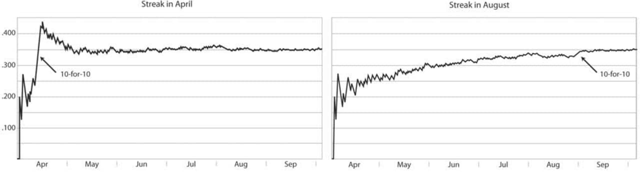
Would you have noticed the streak in August if the arrow wasn’t there? All those big zigzags in April appear much more significant, but they never represent anything better than 2-for-2. Graphs should help us see things we didn’t know about. If what we’re looking for is local trends (such as streaks), these graphs don’t help. They exaggerate all streaks early in the season and hide streaks late in the season. Moreover, they tell very different stories about the season in general. To me, the first says that the player had a tremendous hitting streak in April and leveled off for the rest of the year, while the second shows a gradual upward trend for the whole season. But a 10-for-10 streak in April isn’t enough to change the character of an entire season, is it? (In the next section I’ll suggest a way to answer this question.) In other words, these graphs show the player’s batting average over time. But if we want to see when players are “hot” and when they’re “cold,” we don’t really want to see their batting average. Why? Because batting-average graphs don’t illustrate the player’s day-to-day performance. They illustrate the statistical phenomenon that batting averages stabilize as the season progresses. (Of course, the player’s day-to-day performance is included, but it’s overwhelmed—we can’t see it easily.)
CASE STUDY 2
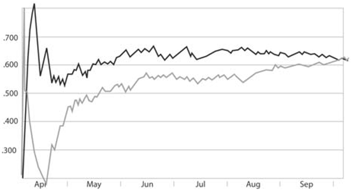
Let’s look at a set of graphs illustrating pennant races. How do we represent a team’s performance at a certain point in the season? A common answer is winning percentage. Like batting average, it’s a cumulative rate statistic and so subject to the same stabilization- over-time phenomenon. Let’s look at the dramatic pennant race between the Brooklyn Dodgers and New York Giants in 1951. The Giants lost 11 straight in April but then won 17 of their next 25 (.680) and by the end of May, they were back at .500. The Dodgers were 10 games ahead, however, and continued to play better baseball over the next 10 weeks. Through August 11, the Dodgers were 13 games ahead and looked like the certain winners. They played over .500 for the remainder of the season, but the Giants went on an amazing 37-of-44 streak (.841) and finished September almost as strong, tying Brooklyn on the last day of the season and winning a best-of-three playoff series. This illustrates the race in terms of winning percentage:
Figure 2
![]()
How well does this graph match up with our understanding of the race? Well, it appears to show that, beginning in April, the Giants had a tremendous losing streak (so far so good) followed by a winning streak almost as significant (also true). Then it looks like both teams leveled off and kept pace with each other until mid-August, when the Giants were slightly better for the rest of the season. From this graph, you would never guess how dramatic the race really was. There is no indication that the Giants’ streak in August was one of the most significant six-week performances ever. It appears to be dwarfed by their April—May streaks, just as our April hitting streak dwarfed the August hitting streak in case study 1. Again, we are not seeing the teams’ performances here, we are seeing the statistical phenomenon that winning percentages stabilize over the course of the season.
CASE STUDY 3
For a final example, let me turn to the subject of “Cumulative Home Run Frequency and the Recent Home Run Explosion,” the BRJ article by Costa, Huber, and Saccoman. The article presents a series of graphs, depicting the cumulative home-run percentages of batters throughout their careers. Home-run percentage is home runs divided by at-bats: another cumulative rate stat. These graphs look much like those we’ve looked at so far (with decreasing variation from left to right) and led the authors to conclude that “as the sluggers’ careers progressed, their [cumulative home-run rate] reached a particular value and remained there.” My point is not that this statement is wrong, but that the authors did not present sufficient information for making that conclusion since home-run percentage is subject to the same stabilization phenomenon as any other rate stat, and graphing it cumulatively over time will almost always yield a line that flattens out.
Another point made in their article that the career home run rates of Bonds, McGwire, and Sosa increase significantly, and the graphs do show that phenomenon. In fact, because their graphs show this increase, we know that actual day-to-day home-run frequencies of those players increased dramatically indeed, far more than the authors likely realized. Bonds hit a home run every 8.2 at-bats (12.2 percent) during his last five full seasons, an outrageous number. The previous five seasons he hit one every 13.2 at-bats (7.6 percent). This increase is literally off the authors’ charts, yet it appears mundane because it is lost as the cumulative sample size increases.
THE SOLUTION
The good news is that there’s a surprisingly simple and generally applicable solution to this problem: instead of graphing a cumulative rate, simply graph the absolute distance from an arbitrarily-chosen rate. For example, if we want to graph a pennant race it usually makes sense to choose .500 as our arbitrary winning percentage (rate) and graph the distance of each team from that rate (in number of wins). For example, take this game log for a hypothetical team:
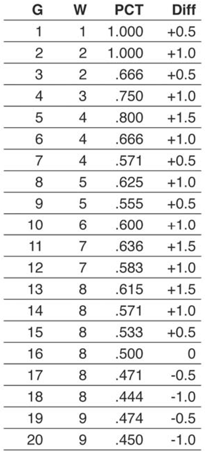
Note that Diff (the difference, what we want to graph) always changes by exactly 0.5. This will be true at any point in the season, and it is consistent with our desire for all wins to be equal (for a win in April to be worth the same as a win in August). Figure 3 illustrates, in our new format, the same graph of the 1951 NL pennant race:
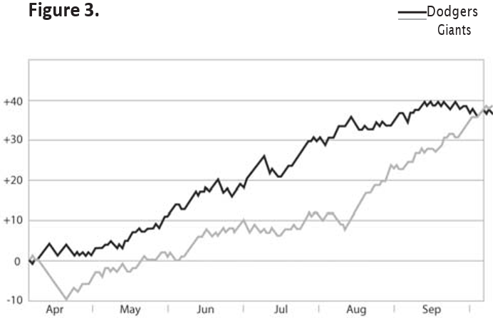
Now we see the things we wanted to see before: that Brooklyn kept playing well until mid-September but New York played extraordinarily well from mid-August to the end, and that the Giants’ performance in August was more significant than their April—May run. We also notice a 31-of-42 (.738) by Brooklyn spanning July and August, which ended just as New York’s run began.
We can do the same thing with our batting-average graphs, although our arbitrary starting point is not as obvious. If we choose .500 again, all batters (realistically speaking) will have a steady downward trend because, as we know, a .500 average is most attainable at the start of the season and becomes less likely as at-bats accumulate. Even when Ted Williams hit .406 he was constantly getting “worse” if we consider .500 as “average.” So we should choose a benchmark that is the batting-average equivalent of a .500 winning percentage—a batting average, for example, of .300. Figure 4 illustrates some data and graphs for a hypothetical batter:
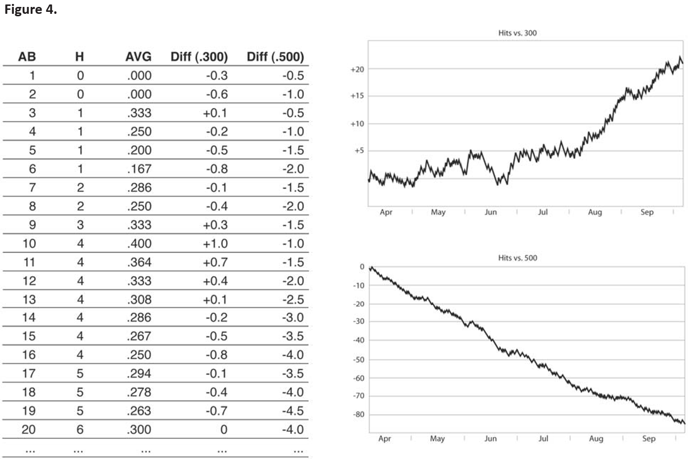
You’ll notice that the hits-from-.300 data, like the pennant-race data, always move in same-size increments, so that each hit is “worth” the same amount. However, unlike the pennant-race graphs, this graph shows those increments as different when the graph is moving upward and when it is moving downward. In general, the amount of each downward move is b and the amount of each upward move is 1-b where b is our arbitrary benchmark.
This inequality may seem strange at first, but think about it this way: Imagine that hitting was so difficult that league leaders hit just .010, which would mean they totaled about five hits a year. Outs would be so common they would hardly bother anyone, but getting a hit would be a big event, and with each one you would be one-fifth of the way to being a league leader. Each hit would help far more than each out hurt. It’s the same, though less dramatic, when we expect our league leaders to hit .340: Each hit helps a bit more than each out hurts.
The choice of benchmark can have a large effect on the appearance of the batting-average graph. A full discussion of this subject is outside the scope of this article, but suffice it to say that you want to choose something in the middle of the dataset’s range. For example, if a player’s average varies between .290 and .350 in a given year, it would be safe to choose .320 as your benchmark. If you’re graphing data for just one player it usually makes sense to use his final average as the benchmark, though the choice of benchmarks generally warrants far more discussion.
Now we also have more insight into the question I asked above: Can a 10-for-10 streak in April affect the character of a batter’s entire season? Can he “level off” and end up hitting .350, as the first graph suggests?
Here are the distance-from-.300 graphs for the same two seasons (see figure 5):
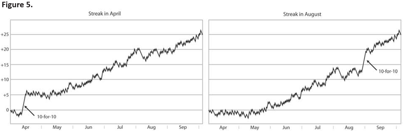
Clearly, the answer is no. These graphs tell us a more sensible story: that a hitting streak early in the season has the same effect on a player’s final average as the same streak late in the season.
RIGHT AND WRONG
At this point, you may be wondering how we can have graphs that display basically the same data and yet look so different. You might also be wondering if the “improved” graphs are subject to some kind of distortion, and you might even be offended that I’ve taken graphs of factual information (winning percentage, batting average, etc.) and manipulated them to align with how I “want” them to look so that they “feel” right.
It seems to me that, while we are accustomed to thinking of numbers as “objective,” they are not. If we return to Tufte’s analogy, even if we all agree on the meaning of terms (in this case. “1,” “2,” “3,” “24,” etc.), as soon as we begin constructing sentences (tables and graphs) they become tools for making arguments, and they can be wielded clumsily or with precision.
I submit that there is no such thing as a “correct” batting-average graph any more than there is a “correct” statement about the quality of a player’s season. However, if you do employ graphs in a discussion, you ought to be aware of the properties and behaviors of the numbers you‘re graphing and be sure to select a sensible dataset or to create a derivative dataset that better isolates the point you want to make, a dataset not dominated by some statistical phenomenon.
As readers of graphs, we also need sufficient statistical literacy to interpret the data. Often the deception lies not in the graph itself but in the data chosen for it. I predict that, in the coming years, as graphing software becomes more accessible, we’re going to start seeing many more graphs of baseball data, and we need to be ready. Graphs make powerful statements, which means they can make statements that are powerfully persuasive but incorrect. We will be fooled, and will miss opportunities for important discoveries, if we don’t understand what we’re looking at.
Notes
1 Gabriel Costa, Michael Huber, and John Saccoman, “Cumulative Home Run Frequency and the Recent Home Run Explosion,” SABR Baseball Research Journal 34 (2005): 37—41.