A Baseball Statistic from the Fourth Dimension
This article was written by John F. Scoggins
This article was published in Spring 2022 Baseball Research Journal
How does one assess an individual player’s contribution to his team’s score? Baseball statisticians have attempted to answer this question countless times. It’s not just the runs he scores himself because that often relies on who batted him in. And it’s not just the runs he bats in, because that depends on who batted previously.
To solve this riddle, statisticians invented the concepts we associate with baseball scoring today. For example, the idea of a base hit versus an error has nothing to do with the rules of baseball. If the batter puts the ball into play on the ground and beats the ball to first base, he is safe. Whether it’s scored a single or an error is irrelevant. These designations are statistical contrivances to facilitate measuring the productivity of an individual batter.
The originators of baseball scoring did what all statisticians are supposed to do, compress an unwieldy amount of data into a usable set of information. But as with all data compression, there is a loss of fidelity, and for baseball statistics, I fear the loss is unnecessarily high. Sometimes a walk is just as good as a single. Sometimes it isn’t. There is no official designation that distinguishes these two kinds of walks.
Traditional, summary batting statistics, such as batting average (BA), on-base percentage (OBP) and slugging percentage (SLG), suffer from well-documented flaws of their own. BA weights all base hits equally but ignores bases on balls and advancing baserunners. OBP counts bases on balls but still counts a single as much as a home run. SLG weights doubles more than singles and so on; however, the weights (i.e., four for a home run, three for a triple) don’t correlate well with runs.
Modern summary statistics, such as Runs Created (RC), Weighted Runs Created (wRC), Weighted On-Base Average (wOBA), Linear Weights (LWTS), Base Runs, Equivalent Runs (EqA), and Wins Above Replacement (WAR), significantly improve upon the traditional summary statistics in terms of accuracy.1 However, they still rely on the same flawed scoring contrivances and come at the cost of greater complexity. For example, Baseball Reference uses six components to calculate WAR for position players, one of which depends on weighted Runs Above Average (wRAA) and wOBA, the latter of which is a combination of several estimated parameters and traditional statistics.2
Complexity is a serious drawback to any statistic. It limits the statistic’s utility and general acceptance by the average baseball fan. A popular remedy is to simply add OBP and SLG together (OPS).3 Although easy to understand, this calculation has the potential to compound the flaws of the traditional statistics rather than eliminate them.
What is needed is a statistic that recognizes how the game is designed and does not rely on subjectively scored events, like errors and base hits. It should not be prone to confounding, the bias that results from ignoring relevant factors. And most of all, it should apply simple arithmetic.
THE SIX DIMENSIONS OF BASEBALL
There are basically three types of team sports. There is baseball and its variations (e.g., softball and cricket), net sports (e.g., volleyball and tennis) and then there are goal sports (e.g., football, soccer, basketball, hockey, rugby, polo, lacrosse, and ultimate frisbee).
That last group might seem oddly diverse, but each of those sports is just a variation of the same basic game. Each team tries to put an object through goals on either side of a rectangular space within a fixed time limit. Anticipating when a team is likely to score is simple. The closer the object is to the goal, the more likely the team is going to score. Besides time, these sports have one continuous dimension for scoring. I believe this simplicity is key to their popularity.
Baseball, however, is anything but simple. Anticipating when a team is likely to score depends on not one, but six different dimensions and they are discrete, not continuous: (1) the number of outs; the disposition of (2) first base, (3) second base, and (4) third base; and the counts of (5) balls and (6) strikes.
It is generally understood that the closer a base runner is to home the more likely he is to score, all things being equal. However, is a team likely to score more runs when there is a man on first and there is none out or when there is a man on second and there is one out? Is a team likely to score more runs when the count is empty (no balls or strikes) or full (three balls and two strikes)?
The answers to these questions are not obvious to the uninitiated. It is much more complicated for the baseball spectator to anticipate when a team is about to score as compared to a basketball or football spectator. I believe this is one reason why the popularity of baseball has waned over time.4
INDIVIDUAL RUN PRODUCTION
Knowing the count of balls and strikes is essential to anticipating when a team is about to score in baseball; however, when measuring an individual’s contribution to a team’s score, we are only interested in the difference from the beginning of an individual’s plate appearance (PA) to the end. Exactly what happens during the PA is not relevant to measuring individual run production (IRP).
Each PA starts with an empty count. Consequently, when we assess the change in the team’s prospects for scoring from the beginning of one PA to the beginning of the next, we need only consider four dimensions (i.e., outs and the three bases). Within these four dimensions there are 24 discrete “locations,” eight configurations of the three bases times three values of outs (2^2 x 2 x 3 = 24).
(Click image to enlarge)
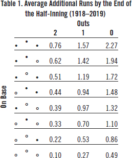
Table 1 shows the average additional runs scored for the 24 starting locations of a PA. The raw data used to create Table 1 were obtained from Retrosheet. They cover 13,099,124 PAs by 13,174 batters in 173,947 games played from 1918 to 2019. This amounts to all American League, National League, and AL-NL interleague games played since 1932 and approximately 75% of those games played from 1918 to 1931.
Suppose a batter is first up in a half-inning. The starting location of the PA is at the bottom right-hand cell. The number of outs is zero and no one is on base. Under average conditions, the team at bat would be expected to score 0.49 additional runs by the end of the half-inning.
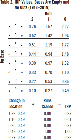
Just what impact on the team’s expected runs can the individual batter make? There are exactly five possible locations by the end of this PA. He can reach first, second, or third safely, score a run, or be out. That’s it. None of the remaining 19 locations is possible.
(Click image to enlarge)
Table 2 shows the possible IRP values from this starting location. If he reaches first base safely, he increases expected additional runs from 0.49 to 0.86 (i.e., 0.37) runs. Reaching second increases expected runs by 0.61 (1.10-0.49) and reaching third increases it by 0.83 (1.32-0.49). If he is out, expected additional runs decrease from 0.49 to 0.27 or by 0.22. A home run doesn’t change expected additional runs at all (i.e., the next batter starts at 0.49 also), but a run is scored so that is the best possible outcome from the PA.
Notice that the IRP difference between a home run and an out (1.00 + 0.22 = 1.22) is approximately double the difference between a single and an out (0.37 + 0.22 = 0.59). Remember that slugging percentage assumes this ratio is four, not two. Of course, this is true only for the special case when the bases are empty and there are no outs. But even under different conditions, a home run is worth far less than four singles, on average closer to three.
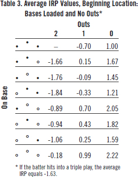
How about when the bases are loaded and there are no outs? That’s more complicated because there are a lot more than five possible outcomes in that scenario. The total number of possible outcomes from this starting location is 24. Table 3 shows the IRP values of 23 of the 24 ending PA locations. If the batter hits into a double play, there can be no more than two runners left on base. Therefore, bases-loaded-and-two-outs is not a possible ending location from this starting location. Also, if the batter hits into a triple play, the half-inning is over, but a run sometimes scores. The average IRP for a triple play equals -1.63.
(Click image to enlarge)
From Table 3, we can see that relative to a hitter recording an out where no one scores (i.e., -0.70), a home run is worth 2.92 (2.22 + 0.70) runs and a single is worth at least 1.7 (1.00 + 0.70) runs. The ratio of a home run to a single is less than 2. Consequently, we can see how much slugging percentage overvalues home runs relative to singles.
The above discussion establishes the basis for the 4-D statistic. Every time a batter comes to the plate, he is at one of the 24 starting locations. Each starting location has from 5 to 24 possible ending locations for a total of 293, each with an associated IRP value. The IRP value equals any runs that score (RBI + ) plus the change in the game location (AGL).
For example, suppose the game location is the bases are loaded and there is one out. According to Table 1, expected runs are 1.57 (top row, second right-hand column). This is a very favorable location for the batter, the fourth highest out of 24.
Suppose the batter hits a fly ball to right field. The runners on third and second tag up. The third-base runner scores a run and the runner on second advances to third. The batter is out, but one runner scores and another is closer to home. Many consider this to be a good outcome for the batter’s team, but is it really?
The game location moves from 1.57 in Table 1 to 0.51, two outs and runners on first and third. The IRP of that PA is therefore 1.00 (the run batted-in) + 0.511.57 (the change in the game location) = -0.06.
The negative value might be interpreted by some to mean that a sacrifice fly is not a good outcome for the batter, but we need to put this outcome into context in order to judge. The batter could have hit a grand slam with an IRP of 2.7 (4 + .027-1.57) or into a double play with an IRP of -1.57, or several possibilities in between. Compared to that worst-case scenario, the -0.06 IRP is a big improvement. An above-average batter might be disappointed with the outcome, but a below-average batter would be happy to hit the fly ball to right field.
The creators of the traditional statistics didn’t have a good solution to measuring the value of a sacrifice fly. They excluded it from BA and SLG completely. OBP is even worse. A sacrifice fly is counted in the denominator of the OBP. So as far as OBP is concerned, a sacrifice fly is just as bad as hitting into a double play.
AVERAGE IRP
Each hitter has his own average IRP: total IRP divided by the number of plate appearances. Every time a batter comes to the plate, he either adds to the actual score or changes his team’s expected score or both.
Although I used average outcomes over a 102-year period in Table 1 to explain the IRP concept, actual IRPs should be calculated using annual averages. A change in the way baseballs were manufactured and the banning of the spitball in 1920 inflated run production during the 1920s and 1930s. Run production reached its nadir in 1968, which induced MLB to lower the pitcher’s mound, whereas there was a scoring surge in the 1990s and 2000s. So, when calculating Ted Williams’s IRPs in 1957, for example, I used the average runs for each game location in 1957.
For each season, the overall IRP is zero. The extra runs produced by above-average hitters are exactly offset by the run deficits produced by below-average hitters. A convenient result is that each season the weighted-average IRP is also zero. This provides a natural reference value when assessing a batter’s average IRP compared to the overall average.
There are 24 starting location values and 293 IRP values for each of the 102 years for which we have data. Obviously, I cannot share all 29,886 (i.e., 293 x 102) IRP values in this article. I can, however, provide an illustrative example.
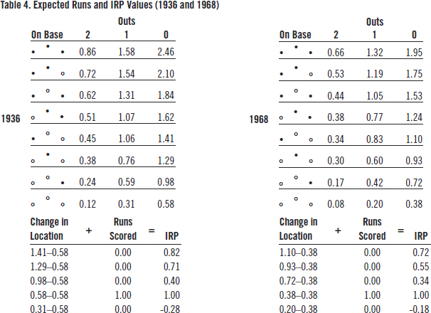
Table 4 shows the 24 starting location run averages and the corresponding IRP values when the bases are empty and there are no outs during the 1936 and 1968 seasons, respectively. I chose those two years because they produced the maximum and minimum runs per half-inning during the time span for which we have data from every game played, 1932-2019.
(Click image to enlarge)
In 1936, 0.584 runs per half-inning were scored. In 1968, the runs per half-inning were only 0.380, a 35% decrease. By 2000, runs per half-inning had increased to 0.577.
In both seasons, the IRP value of a leadoff home run was one run. The IRP of a leadoff triple was greater in 1936 (0.82) than in 1968 (0.72) because once the baserunner reached third base during 1936, he was more likely to eventually reach home than in 1968. On the other hand, leading off a half-inning with an out had a greater opportunity cost in 1936 (-0.28) than in 1968 (-0.18). So, the weighted-average IRP per PA in both seasons was exactly zero.
Notice there is no reliance on walks, singles, doubles, triples, home runs, errors, sacrifices or fielder’s choices. All plate appearances count. Nothing is excluded. Batters who hit into double and triple plays are fully penalized. Batters who advance base runners are given proportional credit.
CAREER-AVERAGE IRP vs. OPS
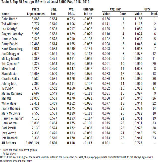
Table 5 ranks the top 25 players by career-average IRP. Only players with at least 3,000 plate appearances during the 1918-2019 timespan are ranked. For comparison’s sake, the right-hand column ranks each player’s OPS for the games covered. As with any large dataset, minor discrepancies exist. That is why the average IRP value over the entire dataset is 0.001, not zero.
(Click image to enlarge)
The first thing to note is how similar the two rankings are. The top seven players are the same in both rankings. Babe Ruth, Ted Williams, and Lou Gehrig are at the top of both lists. Several other familiar names also appear in both top 25 lists: Joe DiMaggio, Mickey Mantle, Stan Musial, Willie Mays, etc.
The next things to notice are the players that fare better with this new ranking as compared to their ranking by OPS. Hank Aaron rises from 33rd by OPS to 22nd by average IRP. Ty Cobb jumps from 47th to 15 th. And this was for only a fourth of his career plate appearances.
There are a few players who fare relatively poorly and are not shown in Table 5. For example, Vladimir Guerrero drops from 29th by OPS to 121st by average IRP. Alex Rodriguez drops from 32nd to 47th.
LEVELING THE PLAYING FIELD
The purpose of this new statistic is to measure an individual’s contribution to the team’s run production while minimizing the confounding that plagues traditional, summary baseball statistics. This was done using simple arithmetic.
To satisfy the more ambitious goal of comparing the individual run production of batters from different eras, however, there are still a couple of adjustments needed that add to its complexity. The first deals with calibration. Calculating a different set of IRP values for each year guarantees that the average IRP will be zero. But that does not affect the variation of IRP values over time. When runs per game are high, so is the variance of runs per game.
Notice from Table 4 that during the high-scoring 1936 season the range of IRP values when the bases are empty and there are no outs is -0.28 to 0.82, a difference of 1.1 runs. During the low-scoring 1968 season, the difference is only 0.9 runs or from -0.18 to 0.72.
When we calculate the yearly IRP standard deviation (SD), we see a pattern similar to that of average IRP. SD peaked in 1936 at 0.407 runs and then declined to 0.298 runs in 1968. There was a precipitous drop in the yearly SD in 1973 when the American League adopted the designated hitter rule. It has remained low by historical standards ever since.
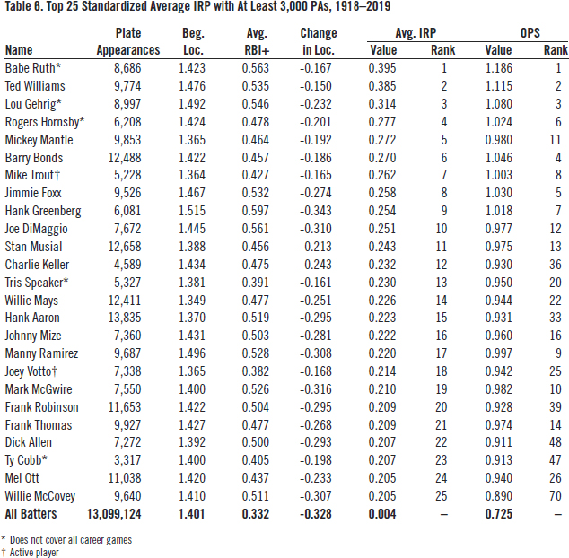
To fully calibrate average IRP for temporal changes in the distribution of scoring, we need to standardize it, not just by its mean value, but also by its standard deviation. As shown by Table 6, this is done by dividing average IRP by that year’s SD. The units are no longer runs; they are standard deviations.
(Click image to enlarge)
Even though Babe Ruth played during an era when the mean and variance of scoring were at their highest, he still leads the pack—and as always, it seems, just ahead of Ted Williams—with an average IRP that was nearly 0.4 standard deviations above the average during his career. Standardizing average IRP has its greatest impact on batters who played during the low-scoring 1960s, e.g., Frank Robinson, Dick Allen, and Willie McCovey.
The second necessary adjustment addresses the difference in starting location. Batting at a favorable starting location—for example, with runners on base and especially with runners in scoring position, is a definite advantage to the batter. Pitchers will locate more pitches in the strike zone. The infielders must move from their optimal fielding positions to prevent the runners from stealing bases and to increase the chances of turning double plays.
To see just how much of an advantage batting from a favorable starting location is, I fitted a weighted least-squares regression model with the standardized average IRP as the dependent variable and average starting location (ASL) as the independent variable. The result is:
Avg. IRP= -0.734 + 0.527 x ASL.
(-28.2) (28.4)
The figures in parentheses are t-statistics. The observation weight is career PAs. The number of observations is 13,174 (i.e., the number of major league batters from 1918 to 2019) and the coefficient of determination (R2) is 0.0576.
For every 0.1 increase in ASL, average IRP increases 0.0527 standard deviations. Using this equation, we can estimate the amount a batter’s actual average IRP exceeds the average batter’s from the same beginning location.
For example, at 1.515, Hank Greenberg had the highest average starting location of the 1,550 ranked batters. Unsurprisingly, he also had the highest number of runners on base per plate appearance, 0.83. The major league average of this statistic over the last 102 years is 0.63. From our regression equation, we know that the IRP for an average batter from that starting location would be 0.527 x 1.515-0.734 = 0.064. Hank Greenberg’s average IRP was 0.254. So, one fourth of his individual run production was due to his favorable beginning location.
Now look at Willie Mays. His average starting location was only 1.349, well below the major league average of 1.401. According to our regression equation, the IRP of the average batter from that beginning location would be 0.527 x 1.349-0.734 = -0.023. Mays’s unfavorable beginning location lowered his run production (0.226) by nearly 10%.
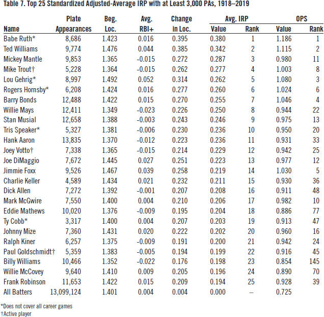
Table 7 ranks the top-25 average IRP values after adjusting for beginning location. Hank Greenberg (not shown in the list) falls to 29th. Willie Mays rises to eighth overall, the highest-adjusted IRP among righthanded batters for whom we have complete data and who have completed their career. Notably, Billy Williams rises all the way from 145th by OPS to 23rd by adjusted IRP.
(Click image to enlarge)
CONCLUSION
Much has been written about the decline of baseball’s popularity. I believe this is due in part to the reliance on bad statistics. More than any other team sport, baseball relies on individual player statistics to measure the ebb and flow of a game, not to mention players’ compensation. So, it’s important that these statistics accurately measure individual run production in a way that is comprehensible to the average spectator.
Using play-by-play data is one way to diminish the confounding that plagues baseball statistics. It emphasizes the predicament in which the batter finds himself when he comes to bat and thus allows us to isolate his individual impact on the team’s score.
There is a cost to this method, however. It requires more information than traditional summary statistics. Play-by-play data currently don’t exist for the most part for the first twenty years of the twentieth century and earlier. Until that statistical record is rebuilt, the full impact of players like Ty Cobb, Rogers Hornsby, and Honus Wagner will likely never be measurable using this method.
JOHN F. SCOGGINS, PhD, is an economist, statistician and consultant. Although he specializes in the economics of healthcare, he has had a life-long passion for the study of baseball. His professional email address is john@scogginsconsulting.com.
Notes
1. Bill James, The New Bill James Historical Baseball Abstract, Simon & Schuster, 2010; Keth Law, Smart Baseball: The Story Behind the Old Stats that are Ruining the Game, the New Ones that are Running It, and the Right Way to Think About Baseball, HarperCollins, 2017; Tom M. Tango, Mitchel G. Litchman, & Andrew E. Dolphin, The Book: Playing the Percentages in Baseball, Potomac Books, 2007; and Alan Schwarz, The Numbers Game: Baseball’s Lifelong Fascination with Statistics, St. Martin’s Press, 2005.
2. “Baseball-Reference.com WAR Explained,” Baseball Reference, accessed February 6, 2022. https://www.baseball-reference.com/about/war_explained.shtml.
3. Pete Palmer, “Why OPS Works,” The Baseball Research Journal, Vol. 48 #2, 2019, 43-48.
4. David Waldstein, “Baseball, Popular but No Longer Dominant, Seeks to Reclaim Its Cool,” The New York Times, October 25, 2021.
5. The data were obtained free of charge from Retrosheet. Interested parties may contact Retrosheet at http://www.retrosheet.org.
6. Other published works that rely on play-by-play data include George R. Lindsey, “An investigation of strategies in baseball,” Operations Research Vol. 11 #4 1963, 477-501; Jim Albert, “Beyond runs expectancy,” Journal of Sports AnalyticsVol. 1 #1 2015), 3-18; and Jim Albert and Jay Bennett, Curve Ball: Baseball, Statistics, and the Role of Chance in the Game, Copernicus Books, 2001.

