

The Most Exciting World Series Games: A Mathematical Approach
This article was written by Peter Reidhead - Ron Visco
This article was published in 2002 Baseball Research Journal
In baseball there are many kinds of excitement. Seeing great catches and timely hits by legendary players, watching your favorite team crush the opposition, having a record set-most fans would be excited by such occurrences. However, we are interested here in the “edge-of-your-seat, who’s going to win the big game” type of excitement.
The reader may reasonably argue that the importance of a game inherently affects its excitement. Also, a fan of a particular team, say the Yankees, might find a Yankees game (especially a victory) more exciting than a game between two other teams. While not denying that viewpoint, this article describes the development of a quantitative model for measuring the excitement of any baseball game using only minimal information, not including the teams involved or when the game was played. That approach is then applied to World Series games, where the importance of each game is consistently high.
ASSUMPTIONS
The intent was to develop a model that quantified the excitement level of baseball games based solely on the line scores: how many runs each team scored each inning over the duration of the game. With this goal, four assumptions formed the basis for the model:
- The most exciting games are those in which the score is close for most of the game.
- Lead changes add to the excitement of a game.
- Closeness in score and lead changes are more important toward the end of the ball game.
- It is not inherently significant how the individual runs are scored during a game.
Overall, the first assumption is the most important. The closeness of the score enhances the importance of all other factors. For example, a remarkable diving catch will seem more exciting in a tie game than in a 13-2 slaughter.
The second assumption expands on the first. Although excitement is tied to how close the score is, it increases when one team overtakes the other team for the lead. Certainly it is exciting to see a team rally for 11 runs in an inning after being behind 6-0. However, the swing in the score is not optimal in terms of sustained excitement; although the second assumption of the model is upheld (i.e., the lead changes hands), the first assumption is violated. The game is not considered very exciting up until this dramatic comeback because it was so lopsided, and it was also not very exciting after the turnaround because it had become lopsided in the opposite direction. Therefore, although lead changes add to the excitement, it is also important that the score is close both before and after the lead change.
The third assumption leads to weighting the end of a game more heavily in the calculations of the model. Similar to the hypothetical situation with the first assumption, a fabulous catch or close play in the first inning is not regarded as exciting as the same exact catch toward the end of a close game. This is not to say that the first half of the game is not important in the calculations of the model. What makes a game the most exciting is a game that not only has a thrilling ending, but was also very close and tense throughout the duration of the entire game.
The final assumption of the model might be the most controversial. When fans are asked about the most exciting way for a run to be scored, many will answer “home run.” Yet it can be equally thrilling to watch the winning run score from first on a double, or score on a sacrifice fly with a close play at the plate. In fact, some would argue that these methods of scoring are more exciting than a home run because the duration of the play is longer; perhaps the runner in the latter case walked, stole second, and moved to third on a grounder to the right side. The tension is sustained, and the outcome during the play is largely uncertain.
The model does not consider how runs score, only when runs score. In addition, the model does not attempt to factor in an individual player’s performance or records that are broken. Certainly, it can be exciting to witness those things, but the model quantifies the excitement level of a game based solely on its merits as a game, not on the merits of individual achievements, such as no-hitters, multiple home runs, etc. Plays that result in outs rather than runs, such as runners thrown out at home, are also beyond the scope of the model.
Based on these four assumptions, a mathematical model was developed. It accepts as input a line score, and assigns a rating or score to that particular baseball game, which could then be ranked against any other individual baseball game. Details on the con- struction and mathematical specifications of the model are given in the appendix at the end.
RANKING OF WORLD SERIES GAMES
The model was used to rate all games in the history of the modern World Series (i.e., since 1903). However, in reporting the results, each game is classified by its number in the given series (game 1, game 2, etc.). In that way, seventh games are not directly compared to second games, and so on. For those who would argue that seventh games, for example, are more important than first games, and hence more exciting, this approach keeps game importance as comparable as possible within a given category. The results are shown in Table 1. For each “game” category, the top ten ranked games (and the number of innings) are presented.
The 1991 World Series between the Twins and Braves, which most contemporary observers agree was one of the greatest ever, has four of its games ranked among the top ten by category: games 3, 4, 6, and 7. The recent 2001 series, between the Diamondbacks and Yankees, has three ranked games; these include the incredible Yankee rallies in games 4 and 5, and the Diamondback ninth-inning comeback in game 7. The famous Red Sox-Reds World Series of 1975 also has three ranked games, including the terrific 7th game and the 6th game with the Fisk home run in the 12th inning.
Two older, but classic, World Series had the top two seventh games. The 12-inning Senators victory over the Giants in 1924 finished first; Walter Johnson finally won the championship after an heroic effort in relief. The incredible 1O-inning Red Sox victory (also over the Giants!) in 1912 came in second; Snodgrass’ famous “muff” contributed to Christy Mathewson’s loss against Smoky Joe Wood in the finale. Each series also had a second ranked game.
The recent five-game series between the Yankees and Mets in 2000 had two ranked games, including the top-ranked game 1, an extra-inning thriller. Also with two ranked games was 1926, with the top-rated game 5 (a 3-2 ten-inning nail biter), as well as the famous game 7, when Old Pete Alexander of the Cardinals came off the bench to fan the Yankees’ Tony Lazzeri with the bases loaded.
Other observations are left to the reader. Given that the model uses only information from line scores, the authors believe that it did a credible job of identifying the most exciting World Series games. Undoubtedly, others will disagree. Arguments are welcome: it’s one of the pleasures of being a baseball fan!
PETER REIDHEAD is a native of Cooperstown and currently works in real estate investment in New York City. He is a graduate of Yale University. RON VISCO lives in Cooperstown, New York, and is an educator at the National Baseball Hall of Fame.
APPENDIX: TECHNICAL SPECIFICATIONS
CONSTRUCTION AND VALIDATION
With those four assumptions, the following framework was used in constructing the model:
- Each of the first three assumptions has a curve representing the relationship of their values.
- The calculations use 1.0 as the maximum value for any given increment.
- The basic increment used in individual calculations for the first three assumptions is the “half inning” (in a standard game where the home team uses its last atbat, there are 18 half-innings).
With this conceptual framework, a statistical model was constructed, using Microsoft Excel for the computer-based calculations. The model allowed line scores to be entered for any game (including extra innings), and would generate a rating based on the assumptions and framework stated.
To refine and then validate the effectiveness of the model, a multi-phase procedure was used. Initially, discussions were held with selected baseball “experts” regarding scoring sequences that maximize excitement in a game; for example, what’s the most exciting 1-0 nine-inning game? (Consensus: the run scores in the bottom of the ninth.) Then line scores for hypothetical games — each of which ended in a 5-4 score — were presented to staff members at the Hall of Fame; they were asked to rank the games in order of excitement. This phase led to some modification of the model, especially the various weighting schemes.
Ultimately, two sets of line scores for actual games were presented to experts. One set represented a wide range of scoring outcomes, and the other set were all close games, including some with extra innings. By the final phase, the ranking of games by the model agreed with the average ranking by the experts.
EQUATIONS AND GRAPHS
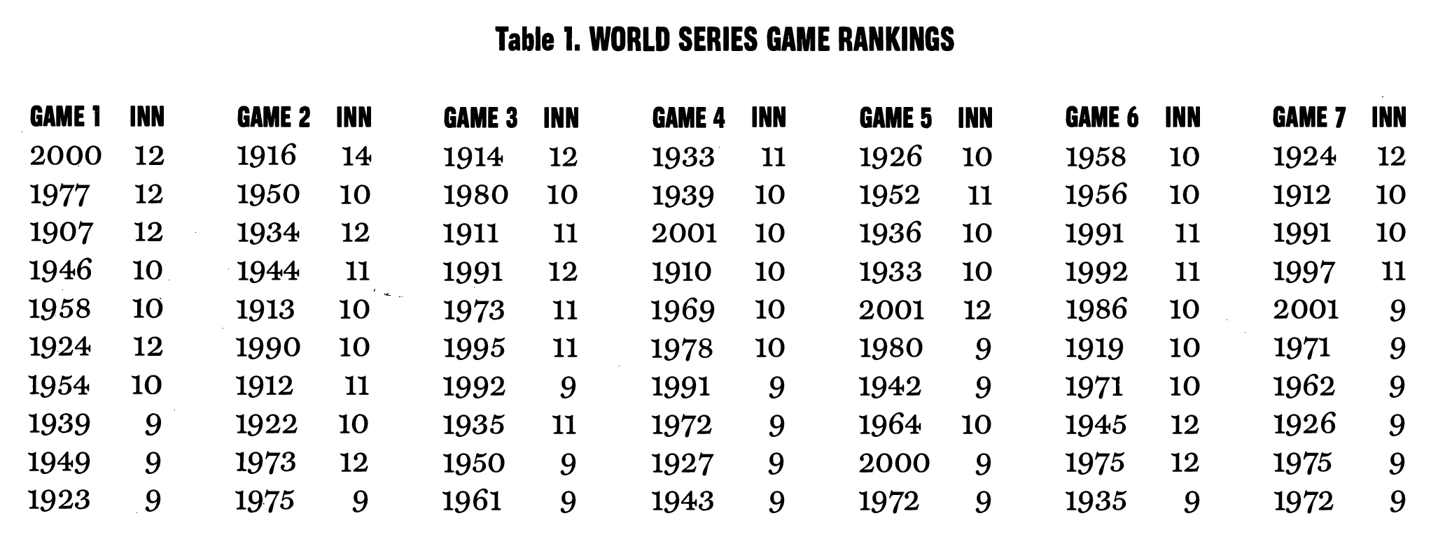
The first assumption is represented by Curve 1 on Graph 1. The “Run Differential” (RD) on the x-axis is the absolute difference between the home team’s run total and the visiting team’s run total at the end ofeach half inning. For example, if a game is tied 4-4, the RD is 0 and has a corresponding y-value of 1.0 (the maximum score for that factor). A tie score is the most exciting score possible in the model. The other extreme is a game where one team is annihilating the other. For the purposes of the model, the extremes only go up to a RD of 24. When one team is beating the other by 24 runs, the “RD Conversion” (RDC) is only .01. In other words, at such a lopsided score, the game is not exciting. With the two extremes of the model defined, the points in between were filled in. Going from -24 to 0, the curve rises gradually, with the RDC for a one-run game very close to a tie ball game on the curve. For every half-inning of a game, Curve 1 produces a number on the y-axis, which is used in a later calculation.
The Curve 2 represents the second assumption of the model. This curve is similar to Curve 1, but involves one more step in producing an actual number. The second assumption uses the absolute difference in score at the beginning and end of each half inning to produce a conversion number, and measures the absolute vertical distance traveled on Curve 2 between the beginning and end of each half inning. Similar to Curve 1, Curve 2 is shaped to recognize the corresponding excitement for a change. Suppose, for example, the score at the beginning of the half-inning is 4-2: the resulting y-value is .78. If the offensive team then scores one run to make it 4-3, the second resulting y-value is .87. The “Lead Change Conversion” (LCC) is simply the difference between these two numbers, or .09. If, however, the team behind 4-2 had instead scored five runs and now had a lead of 4-7, the LCC calculation would be the follow ing: (1.0 – .78) + (1.0 – .72) = .50. Thus, Curve 2 results in a higher score when the path traveled in the half inning goes from one side of the curve over the peak and back down to the other side.
The observant reader may notice that the two assumptions (and thus the two curves) counterbalance each other to a certain degree. In other words, when you maximize one factor, the other factor is minimized. For example, in order to maximize the first assumption, a score would be tied at the beginning and end of a half inning, producing scores of 1.0 for Curve 1, but a score of 0.0 for Curve 2 (since there was no change in the score). But the Curve 2 is maximized when a half inning starts at -24 and ends at +24 for a score of .998, whereas Curve 1 produces scores of .01. Therefore, the intersection points of the two curves are of great importance. These occur approximately at RDs of -2 and +2. The significance of this is that the highest possible sums for the results from Curves 1 and 2 occur within the range -2 to +2.
Calculations based on these two curves are thus used to generate the following expression:
(Curve 1 score) + (Curve 2 score)
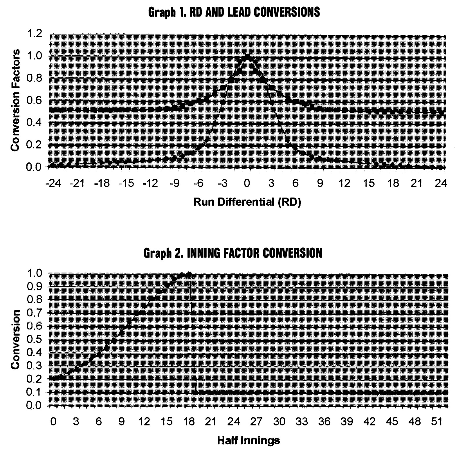
At this point we turn our attention to the third assumption, whose values are plotted in Graph 2. Similar to the first two curves, Curve 3 uses an asymptote of 1.0 as its maximum value. The beginning of the game is weighted at approximately 0.2 and increases gradually until it reaches 1.0 at the 18th half inning. In other words, the end of a game is weighted approximately five times as heavily as the beginning of the game. Although the shape and value of this curve might seem arbitrary, it was based on the results of the validation process and other factors.
Note that the graph allows for extra-inning games. Although the weighting for the ninth inning is close to the asymptote, the subsequent half innings are weighted at 0.1. Although an extra-inning game will almost always score very well by virtue of its inherent closeness, the low weighting of 0.1 for the extra half innings makes it possible for very exciting nine-inning games to compete against extra-inning games. (Some readers may disagree with the low weighting assigned to the extra innings, note that if the weighting for the extra innings had been 0.0 instead of 0.1 [i.e., the model only considered the first nine innings], 67 of the 70 games ranked in the final section of this article would have nonetheless still been ranked in the top 10 of their game category.)
With the third curve, we can complete the equation:
[(Curve 1 score)+ (Curve 2 score)] X (inning factor) = half inning score
Every half inning of the game receives a half-inning score, and when the game is completed, the half inning scores are aggregated for the final game score.