

Effect of Batting Order (Not Lineup) on Scoring
This article was written by David W. Smith
This article was published in 2006 Baseball Research Journal
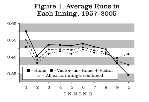
This present study is an outgrowth of my presentation in 2004 at SABR 34 in which I addressed the pattern of scoring in a game, such as the possible importance of one-run wins, come-from-behind wins, etc. The first point to establish is the rate of scoring by home and road teams in each inning. The results for 1957–2005 are in Figure 1.
(Click all images to enlarge)
Two points of special note are:
-
More runs are scored in the first inning than any other, and this difference is by a wide margin, especially for the home team.
-
The home team averages more runs than the visitors in each of the first eight innings, although that pattern reverses in the ninth inning and later.
This second point deserves an additional comment. At first glance, it might seem surprising that the home team scoring drops so dramatically in the ninth and extra innings. However, most of this apparent decline is accounted for by the fact of “walk-off” wins. That is, when the home team gets enough runs to win in the ninth inning or later, they stop batting, with the result that fewer total runs are scored. For the period studied here, 1957–2005, there were 9,053 walk-off wins, which works out to one in every 10.5 games. This sizable number would seem to be enough to account for a substantial portion of the observed drop. Included in this total are 4,646 extra-inning wins by the home team, all of which are, of course, walk-offs.
My friend Clem Comly suggested a different way to look at scoring rate for these innings, which is to normalize scoring per three outs made in each inning. In this way the partial innings of the walk-offs will be mitigated to some extent. The result of that recalculation is seen in Figure 2.
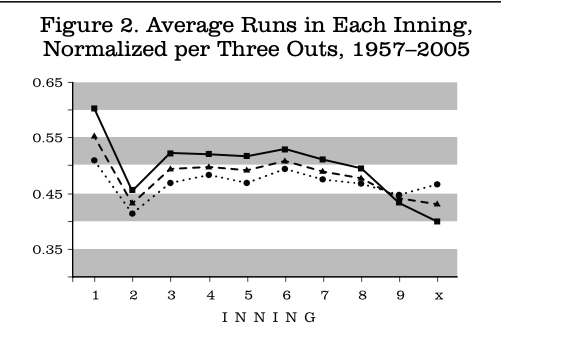
The values for the first eight innings are, of course, unchanged, as are those for the visitors in the ninth and extra innings. The rates for the home team in these last two categories are increased, as expected, but they don’t quite catch up to the visitors because there are still many potential runs that are not scored due to the walkoffs.
It occurred to me and to several who saw these results at SABR34 that a good place to start in trying to figure out the underlying factors causing this pattern was to consider which batters were likely to bat in each inning. Therefore, I began my journey into the land of lineup studies, territory already well staked out by Mark Pankin (see, for example: http://www.pankin.com/markov/btn1191.pdf ). However, Mark’s pioneering work has concentrated on the starting lineup and how variations there can affect scoring. He also made great use of sophisticated modeling to explore these questions in very interesting ways. Tom Ruane has also done some Markov modeling work on the effect of lineups (www.retrosheet.org/Research/RuaneT/lineup_art.htm).
My approach here is a bit different in two ways. First, I looked at actual performance data, not model results, and second, I focused on the consequences of different lineup positions batting first in a given inning, not on the starting lineup. It is essential to distinguish clearly between the starting lineup and the batting order in a given inning. When I refer to the starting lineup, I will use the term “lineup slots,” whereas when I refer to the batting order in an inning, I will speak of the first batter, second batter, etc.
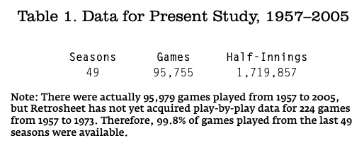
This analysis requires play-by-play data and I used the Retrosheet files from 1957 through 2005, as summarized in Table 1.
The basic pattern of which batter leads off an inning is shown in the following two tables, with raw totals in Table 2 and the same information in percentage form in Table 3, which allows much easier comparisons.
There are several interesting features here. First of all is the surprise that there was actually a first inning in which the batter in the 8th slot batted first! This occurred on June 9, 1961 (game 2) in Boston when the Angels had a batting out of order situation which resulted in the first and eighth-place batters swapping places the first time through the order. The lineup slot which bats first most often in an inning moves around the lineup fairly smoothly as the game progresses. The highlighted boxes in Table 3 indicate the three lineup slots which lead off each inning most frequently. Those marked in boldface are those in which the three most frequent slots to bat first are at least 40% of the total. Those underlined are less than 40%. In the second inning, the leading three slots (number 4 through 6) comprise over 81% of the total and by the ninth inning, the three most frequent are just under 36%, reflecting the expected randomization in the first slot as the game proceeds.
Table 2. Number of Times Each Lineup Slot Batted First in an Inning
|
Slot |
1 |
2 |
3 |
4 |
5 |
6 |
7 |
8 |
9 |
Extra |
Total |
|
1 |
191509 |
1992 |
36609 |
16260 |
25562 |
26305 |
20948 |
24872 |
15844 |
5063 |
364964 |
|
2 |
0 |
616 |
20841 |
26610 |
16393 |
26203 |
17268 |
23309 |
15157 |
4661 |
151058 |
|
3 |
0 |
273 |
12578 |
33101 |
11886 |
25889 |
17936 |
22164 |
16361 |
4660 |
144848 |
|
4 |
0 |
68494 |
6678 |
31786 |
11935 |
23353 |
19707 |
19798 |
16758 |
4167 |
202676 |
|
5 |
0 |
52683 |
3957 |
27726 |
17365 |
20528 |
22067 |
18761 |
17514 |
4288 |
184889 |
|
6 |
0 |
34656 |
2205 |
22373 |
24039 |
17558 |
24138 |
18885 |
18032 |
4523 |
166409 |
|
7 |
0 |
19377 |
26877 |
16194 |
28312 |
15324 |
24361 |
19459 |
17348 |
4258 |
171510 |
|
8 |
1 |
9268 |
41042 |
10857 |
29527 |
16627 |
23642 |
20885 |
16138 |
4478 |
172465 |
|
9 |
0 |
4151 |
40723 |
6603 |
26484 |
19526 |
20999 |
22723 |
15239 |
4590 |
161038 |
Note: “Extra” refers to all extra half innings. The 40,688 extra half innings reported here occurred in 8971 games, an average of 4.5 per game.
|
Slot |
1 |
2 |
3 |
4 |
5 |
6 |
7 |
8 |
9 |
Extra |
Total |
|
1 |
100 |
1.0 |
19.1 |
8.5 |
13.3 |
13.7 |
11.0 |
13.0 |
10.7 |
12.4 |
21.2 |
|
2 |
0 |
0.3 |
10.9 |
13.9 |
8.6 |
13.7 |
9.0 |
12.2 |
10.2 |
11.5 |
8.8 |
|
3 |
0 |
0.1 |
6.6 |
17.3 |
6.2 |
13.5 |
9.4 |
11.6 |
11.0 |
11.5 |
8.4 |
|
4 |
0 |
35.8 |
3.5 |
16.6 |
6.2 |
12.2 |
10.3 |
10.4 |
11.3 |
10.2 |
11.8 |
|
5 |
0 |
27.5 |
2.1 |
14.5 |
9.1 |
10.7 |
11.5 |
9.8 |
11.8 |
10.5 |
10.8 |
|
6 |
0 |
18.1 |
1.2 |
11.7 |
12.6 |
9.2 |
12.6 |
9.9 |
12.2 |
11.1 |
9.7 |
|
7 |
0 |
10.1 |
14.0 |
8.5 |
14.8 |
8.0 |
12.8 |
10.2 |
11.7 |
10.5 |
10.0 |
|
8 |
0 |
4.8 |
21.4 |
5.7 |
15.4 |
8.7 |
12.4 |
10.9 |
10.9 |
11.0 |
10.0 |
|
9 |
0 |
2.2 |
21.3 |
3.4 |
13.8 |
10.2 |
11.0 |
11.9 |
10.3 |
11.3 |
9.4 |
It is not surprising that the first three men in the lineup are quite unlikely to lead off the second inning, but the low totals for the number 4, 5, and 6 men to lead off the third are perhaps a bit unexpected. Finally, note that the clear leader in times leading off the second inning is the fourth batter in the lineup. This takes us to a related concept, which is somewhat of a mirror image of which batter leads off an inning, namely which position makes the last out (that statement does not do justice to innings which end on caught-stealing or pickoff plays). This means that the most common single result of the first inning (35.8% of the time) is that the side is retired in order or one runner reached base and was retired on a double play, caught stealing or via pickoff. This is true even though the scoring rate is highest in this inning.
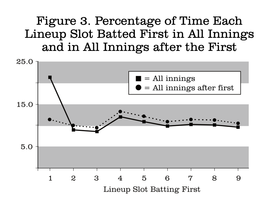
The last column in Table 3 shows that the batter in the leadoff slot is the first batter in 21.2% of all innings with the other eight positions fairly evenly distributed in comparison. Of course, this predominance of the leadoff batter is greatly influenced by the first inning reality. If the first inning totals are removed and the numbers renormalized, then there is much evenness across the slots. In fact, after the first inning the fourth and fifth slots in the starting lineup are the most likely to bat first. These percentages are presented in Figure 3.
The possibility of differences between the visiting and home teams must also be considered. I did that comparison, and only one of the 90 entries in Table 3 showed even a one percent difference between visitors and home. That is, the fourth-place slot batted first in the second inning for the visiting team 37.5% of the time and 34.0% of the time for the home team. This means that the visitors went out in order in the first inning more often than the home team did. This is reflected in the higher average number of first inning plate appearances for the home team: 4.42 as compared to 4.28 for the visitors. This percentage difference appears small, but does represent over 13,000 more home team batters in the first inning over the 49 years studied.
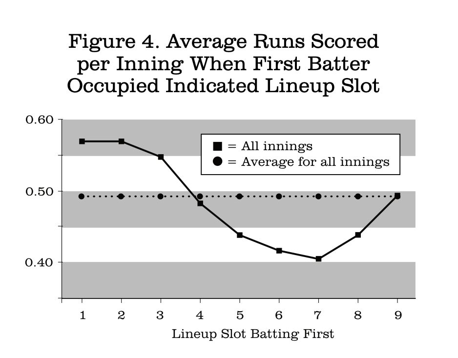
Of course, the most important measurement is scoring. Figure 4 presents the average number of run scored in each inning when the first batter in the inning was in the indicated lineup slot. The numbers here are the averages across all innings. As expected, I found some variation between individual innings, but I am not reporting those details here for two reasons. First, as we have seen, each inning/batter combination occurs with greatly varied frequency, so comparisons become less valuable. For example, the batter in the third slot bats first in the second inning only 0.1% of the time, so the runs scored in those innings don’t have much meaning in a comparative sense. Second, tables with 90 data points in them are cumbersome and not easy to read. This figure will be the standard format for the bulk of the presentation.
There is a remarkable relationship between the first batter in an inning and the chance of scoring. The first two slots in the lineup are equally valuable as first batters in terms of scoring, followed by a steady but non-linear decline to the seventh place batter, ending with a definite upturn for the last two spots.
This pattern may be unexpected at first, especially the observation that when the men in the fourth-and fifth-place slots bat first, the result is virtually the same as when the inning begins with the ninth- and eighth-place batters, respectively. However, we must remember that the scoring is the result of everyone who bats in that inning, not just the first batter. On average across all innings there are about 4.3 batters per inning (data not shown). Therefore, when the fourth slot leads off, then the eighth and ninth slots bat as the fourth and fifth men that inning.
On the other hand, when the eighth-slot batter leads off, then the inning gets back to the top of the order in three batters which leads to more scoring, even if the man starting the inning made an out. I wanted to be sure that the high results when the leadoff man bats first were not overwhelmed by the first inning effect. When those totals are removed, then the average number of runs scored when the leadoff man bats first in an inning other than the first is 0.56, indistinguishable from the data in Figure 4.
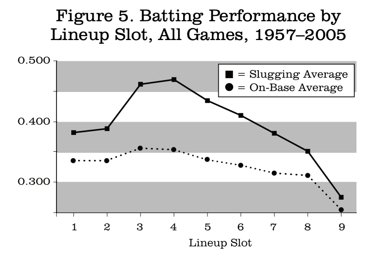
I wish to emphasize that the numbers in Figure 4 represent the combined effect of all the batters in an inning, simply separated by lineup slot of the first batter. The actual performance of batters in the individual slots is shown in Figure 5. The performance of each lineup position in isolation follows the expected pattern and is quite different from the batting order analysis above.
The next variable I looked at was the effect of the DH. There are ample data from several sources that AL teams score more than NL teams since 1973, but it is very clear that the difference in totals is accounted for entirely by the DH (see, for example, Table 3 in http://www.retrosheet.org/Research/SmithD/batlearn.pdf). Figure 6 presents the differences in run scoring between the two leagues. There is a striking effect of substituting the DH for the pitcher, with a major effect upon which lineup slot bats first.
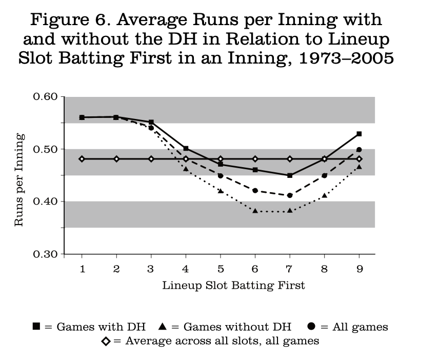
For the leadoff and number two slots, the leagues are the same, because innings that begin this way are very unlikely to have the pitcher bat. Differences appear through the rest of the batting order, with the widest discrepancy being found when the men in the sixth and seventh slots bat first and the pitcher will very likely come to the plate in NL games and thereby decrease scoring in those innings. The overall level of scoring is slightly higher since the advent of the DH (data not shown).
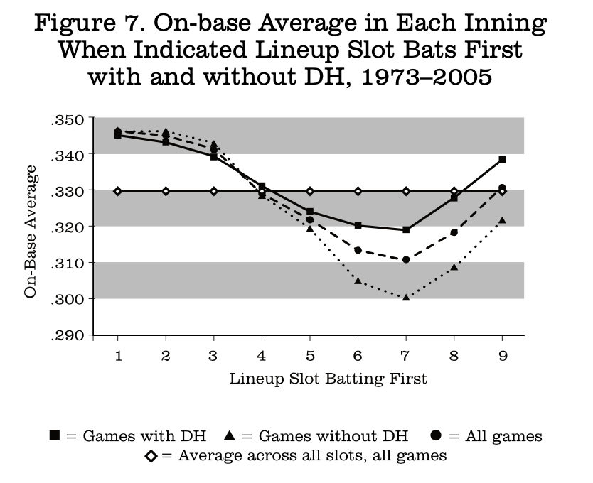
I then investigated how the scoring difference arose by looking at on-base and slugging averages for the teams as a function of which lineup slot bats first. Figure 7 has the on-base data, which show even fewer differences for first five slots than the scoring average did. However, there are wide differences for innings that begin with line- up spots six through nine, with the seventh slot showing the biggest difference.
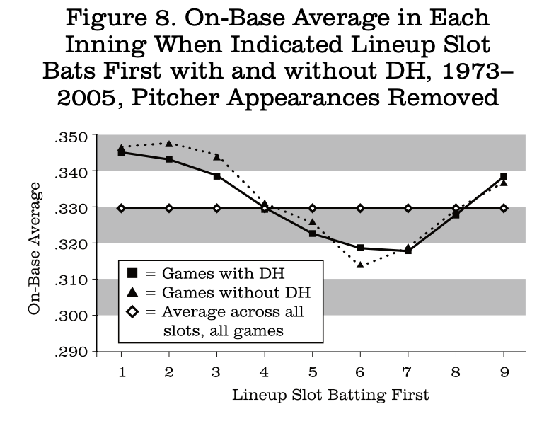
As noted above, almost all production differences between the leagues since 1973 are due to pitcher batting. I therefore recalculated the data of Figure 7 by omitting all plate appearances by pitchers. The results are in Figure 8, where we see that there is now some separation for innings that start with the second and third slots, but that the differences have almost completely disappeared from the fourth slot to the ninth.
To finish the study of the DH, I prepared the parallel two figures for slugging average. These are Figures 9 and 10.
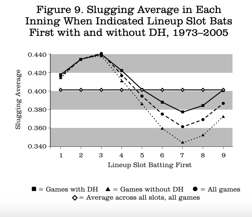
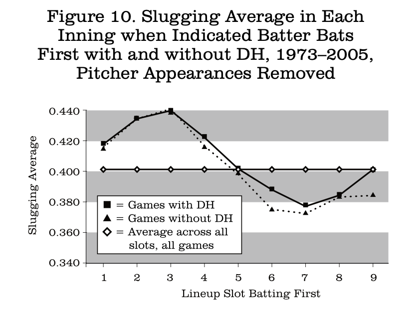
Once again, the removal of pitcher appearances brings the two leagues very close together, even closer than was seen for on-base average. The largest difference is found for the ninth slot, with the low National League value representing a large number of pinch-hitters who have a collective slugging average of .329 over these seasons.
There is one more topic I wish to discuss, and that is related to some work I did previously on batter learning. I made a presentation on this at the SABR meeting in Kansas City in 1996 and published an expanded version in the Baseball Research Journal in 2006. Briefly, what I discovered is that there is a dramatic improvement for starting batters against starting pitchers in batting average, on-base average, and slugging average between their first, second, and third times at bat. Figure 11 is a summary of these results:
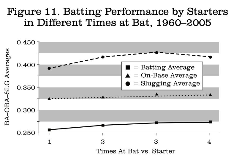
At first glance it appears that the scoring and batting order results I presented today do not agree with the batter learning study. As shown above in Figure 1, there is much more scoring in the first inning than in any other, followed by a great decline in the second inning. How can this be if batters are producing at a much lower rate their first time up, especially in terms of slugging average? The answer turns out to be simple and perhaps obvious. There is no disagreement and the apparent differences can be explained entirely by which batters typically bat in the first. Table 4 presents the percentage of plate appearances for each lineup position in each inning.
The numbers in Table 4 differ quite a bit from those in Table 3, which showed the percentage of times that each batting order slot batted first. The bulk of appearances (84.5%) in the first inning are by the best batters (see Figure 5), and in the second inning the weaker batters predominate (74.7% of total). In no other inning besides the first two is there such a disproportion in plate appearances between the different lineup slots. So, even though batters in all lineup positions do better the second and third times they bat, the absolute level of the most common batters in the second inning is very low. Since the numbers here represent starting batters, the percentage of batters from the ninth slot is low as the game progresses and starting pitchers are removed.
Table 4. Percentage of Plate Appearances by Starting Batters in Each Lineup Slot in Each Inning
|
Slot |
1 |
2 |
3 |
4 |
5 |
6 |
7 |
8 |
9 |
Extra |
|
1 |
23.4 |
6.1 |
19.0 |
6.4 |
16.0 |
9.5 |
12.1 |
15.7 |
8.8 |
14.7 |
|
2 |
22.9 |
3.3 |
18.2 |
7.9 |
14.2 |
11.9 |
9.5 |
16.2 |
10.1 |
13.2 |
|
3 |
23.3 |
1.6 |
15.4 |
11.1 |
11.5 |
14.2 |
8.3 |
15.2 |
12.7 |
12.7 |
|
4 |
15.0 |
10.1 |
11.7 |
14.3 |
9.1 |
15.2 |
9.0 |
12.6 |
14.7 |
11.2 |
|
5 |
8.5 |
16.9 |
8.0 |
16.0 |
8.2 |
14.7 |
11.1 |
10.0 |
15.6 |
11.0 |
|
6 |
4.3 |
21.4 |
4.8 |
15.9 |
9.2 |
12.9 |
13.8 |
8.5 |
14.9 |
11.1 |
|
7 |
1.9 |
20.4 |
6.3 |
14.1 |
11.7 |
10.3 |
15.6 |
8.6 |
12.4 |
11.9 |
|
8 |
0.7 |
16.0 |
10.7 |
11.1 |
14.3 |
8.3 |
15.3 |
9.3 |
8.6 |
11.1 |
|
9 |
0.1 |
4.1 |
5.9 |
3.1 |
5.9 |
3.0 |
5.3 |
3.9 |
2.1 |
3.2 |
Conclusions
-
The lineup slot of the first batter in an inning matters a great deal in a team’s average scoring.
-
Lineups appear to be well designed in that the best scoring results are seen when the man in the leadoff slot bats first in any inning.
-
The lowest scoring per inning occurs when the seventh slot leads off the inning.
-
There is a DH effect, but it affects only the detailed rates, not the basic patterns.
DAVID W. SMITH received SABR’s highest honor, the Bob Davids Award, in 2005. He is the founder and president of Retrosheet. This paper was presented in July 2006 a SABR36 in Seattle.