

Why do games take so long?
This article was written by David W. Smith
This article was published in Fall 2018 Baseball Research Journal
This article is based on the presentation I gave at SABR 48 in Pittsburgh in 2018 to address the issue of game length which has become a hot issue in recent years. In 2014, then-commissioner Bud Selig announced the formation of a committee to investigate the issue. Since taking office, current commissioner Rob Manfred has taken steps to reduce game time including rules changes that limit mound visits, a countdown clock between innings, and has spoken openly about the possibility of introducing a “shot clock” for every pitch.
The commissioner’s concerns are not new. Ban Johnson, the original and long-time president of the American League, was agitated by what he considered slow games as long ago as 1909. As the headline in a December 2, 1909, issue of The Sporting News reads: “Why Games Drag: Too Much Practice Time Taken Between Innings.”
In the article, Johnson had noted that several games had exceeded two hours and he decided that teams took too much time throwing the ball around the infield at the start of each inning after the pitcher’s warmup throws. He was supported by veteran umpire Tom Brown who said: “The practice work does not belong in the game.”
In 1925, Johnson was still banging that drum. The St Louis Post-Dispatch had a story headed: “President Johnson of American League Moves to Speed up Games.”
The article noted: “Contests in the A.L. this season have frequently run more than two hours and Johnson wants to know the reason why. A report must be sent to President Johnson on all games running over two hours, with the reasons for the delays. If it is because of arguments, the guilty athletes will be punished”.
For the record, 269 of the 616 AL game that year were over 120 minutes—44%—and the league average was 120.8 minutes.1 One can only imagine what Johnson’s reaction would be to our current average game time, which is now over three hours! Why do games take so long? Various culprits have been blamed depending on who’s answering, making it high time for a sabermetric look at the issue. I decided to take a long view to examine many years to look for patterns and trends that can be measured quantitatively.
The data for this study come from Retrosheet (www.retrosheet.org) and I was able to study 183,224 games over the course of 108 seasons, 1908 through 2017 minus 1918-19.2 In order to make fair comparisons, it is necessary to remove games whose times were skewed, including extra-inning games, and games that ended early due to rain, curfew, or other reasons. The remaining “regulation-length” games are then divided into those where the home team does or does not bat in the bottom of the ninth.
Table 1: Regulation-length Games
| Length | Games | Percentage |
|---|---|---|
| 8.5 | 80968 | 44.3 |
| 9.0 | 83516 | 45.7 |
| All | 164484 | 90.0 |
How has the length of the average game changed? It has definitely grown over time. Figure 1 shows the data from 1908-2017, excluding 1918 and 1919, but including the extra innings games this time to see the extreme values.
Figure 1. Average minutes for all games, 1908-2017
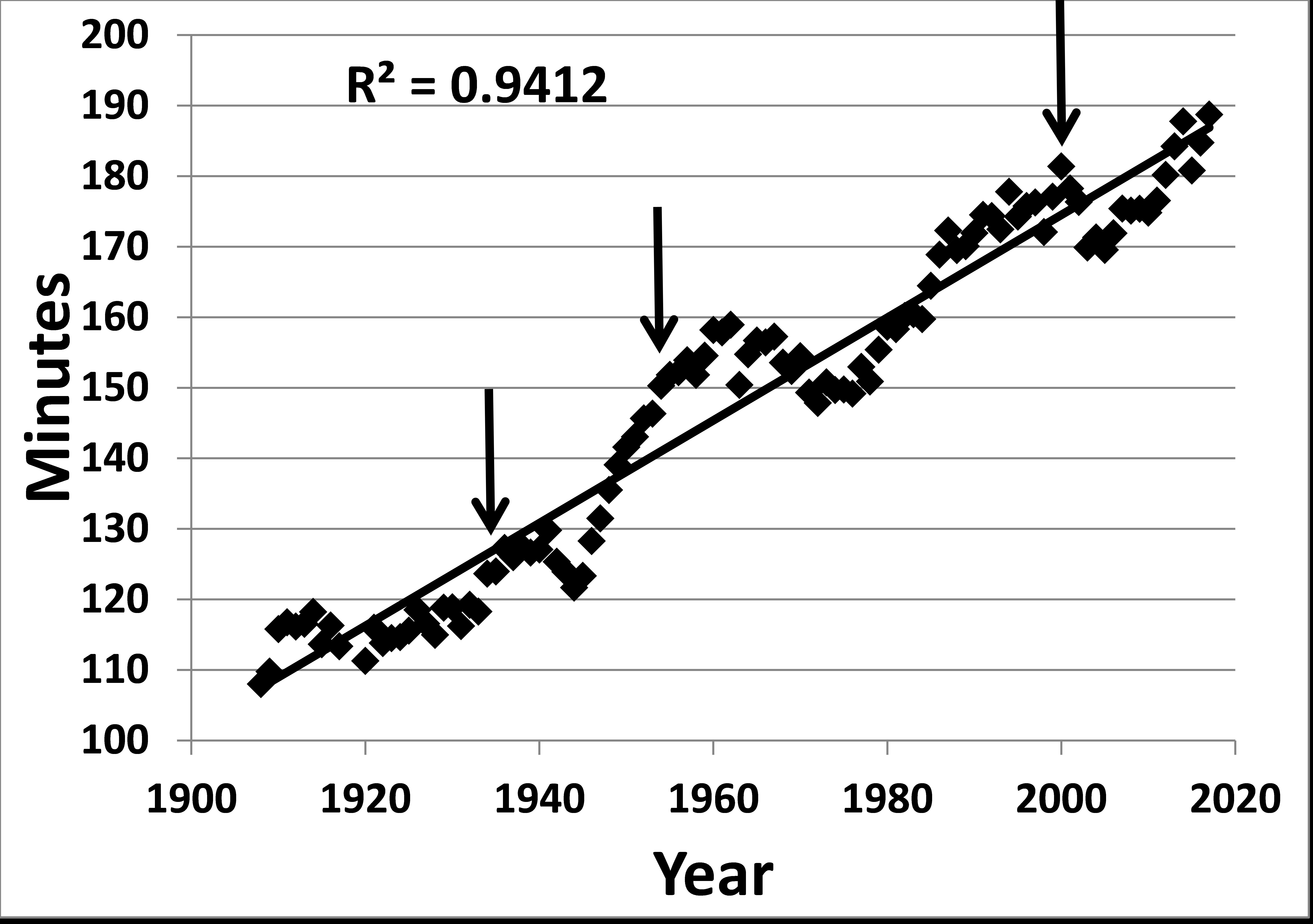
The figure shows the expected annual variations and periods of rise as well as decline. However, when a linear regression is performed to determine the best fit line, the result shows an extremely strong direct relationship with the R2 value (coefficient of determination) indicating that 94% of the variance in the game length is accounted for by the passage of the years. Highlights along this 110 year trip are marked with arrows and summarized here.
Table 2: Landmarks in game length
| Year | Avg (in minutes) | Landmark |
|---|---|---|
| 1934 | 123.6 | 1st year with 2+ hour average |
| 1954 | 150.3 | 1st year with 2.5 hour average |
| 2000 | 181.4 | 1st year with 3+ hour average |
| 2017 | 188.7 | Longest average game time |
At SABR 47 in New York, Steve Steinberg asked me what the relation was between number of pitches and game length. Retrosheet’s pitch data hav two distinct components. For the years 1947–64 we have 2,739 games from Allan Roth of the Dodgers, and from 1988 to present we have 68,566 games from Project Scoresheet, Baseball Workshop and MLBAM. Figure 2 shows the answer to Steve’s question for all regulation-length games from this entire period, covering more than 64,000 games and over 18 million pitches.
Figure 2. Regulation game length and number of pitches.
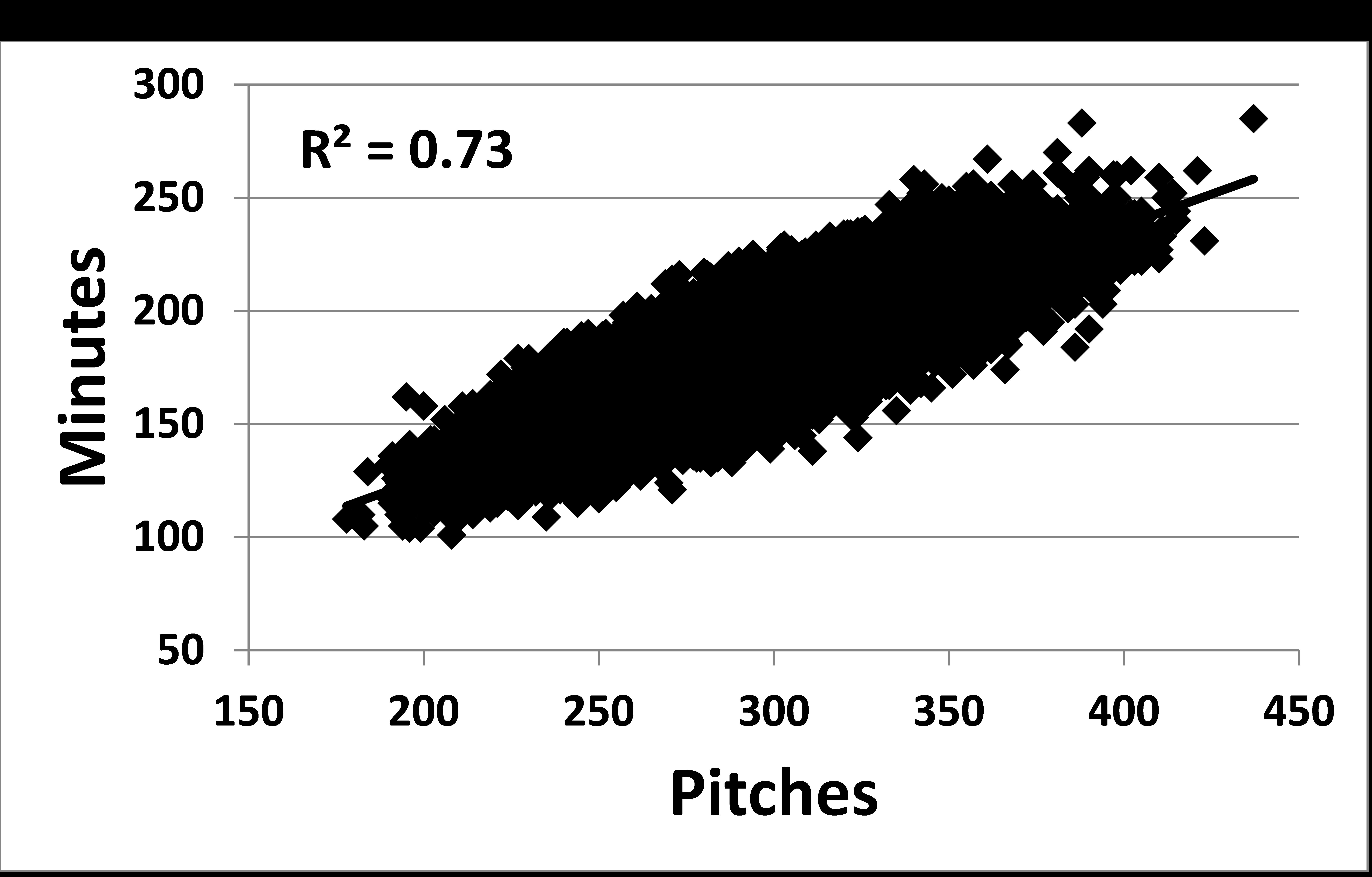
There are several points to make about Figure 2. The R2 value of 0.73 mean that the number of pitches in a game explains nearly three quarters of the variance in the time of game. That is a strong relation, although we would always like it to be more. I did analyze the 8.5- and 9-inning games separately and also the Roth games separately from the modern ones. The Roth data fit in extremely well with the modern information so there is no need to present separate graphs. Also the calculated slopes of the lines for 8.5 and 9 inning games are only slightly different and I therefore combined them in this one figure.
This figure includes very large ranges in both pitch totals and game times. These extremes and the averages are summarized in Table 3.
Table 3: Ranges and Averages of Pitch Totals and Game Length in Regulation-Length Games
| 8.5 innings | 9.0 innings | |
|---|---|---|
| Min. pitches | 145 | 178 |
| Max. pitches | 439 | 437 |
| Min. minutes | 93 | 101 |
| Max. minutes | 271 | 285 |
| Avg. pitches | 274 | 289 |
| Avg. minutes | 166 | 176 |
Playing the bottom of the ninth adds an average of 10 minutes and 15 pitches to the game.
Having seen this clear importance of the number of pitches on the time of game, I then set about looking for explanations of what would make the number of pitches increase. I checked several categories of offensive quantitative categories such as runs, hits, and walks, as shown in Figure 3. All values are for both teams combined.
Figure 3. Major offensive categories, 1908-2017
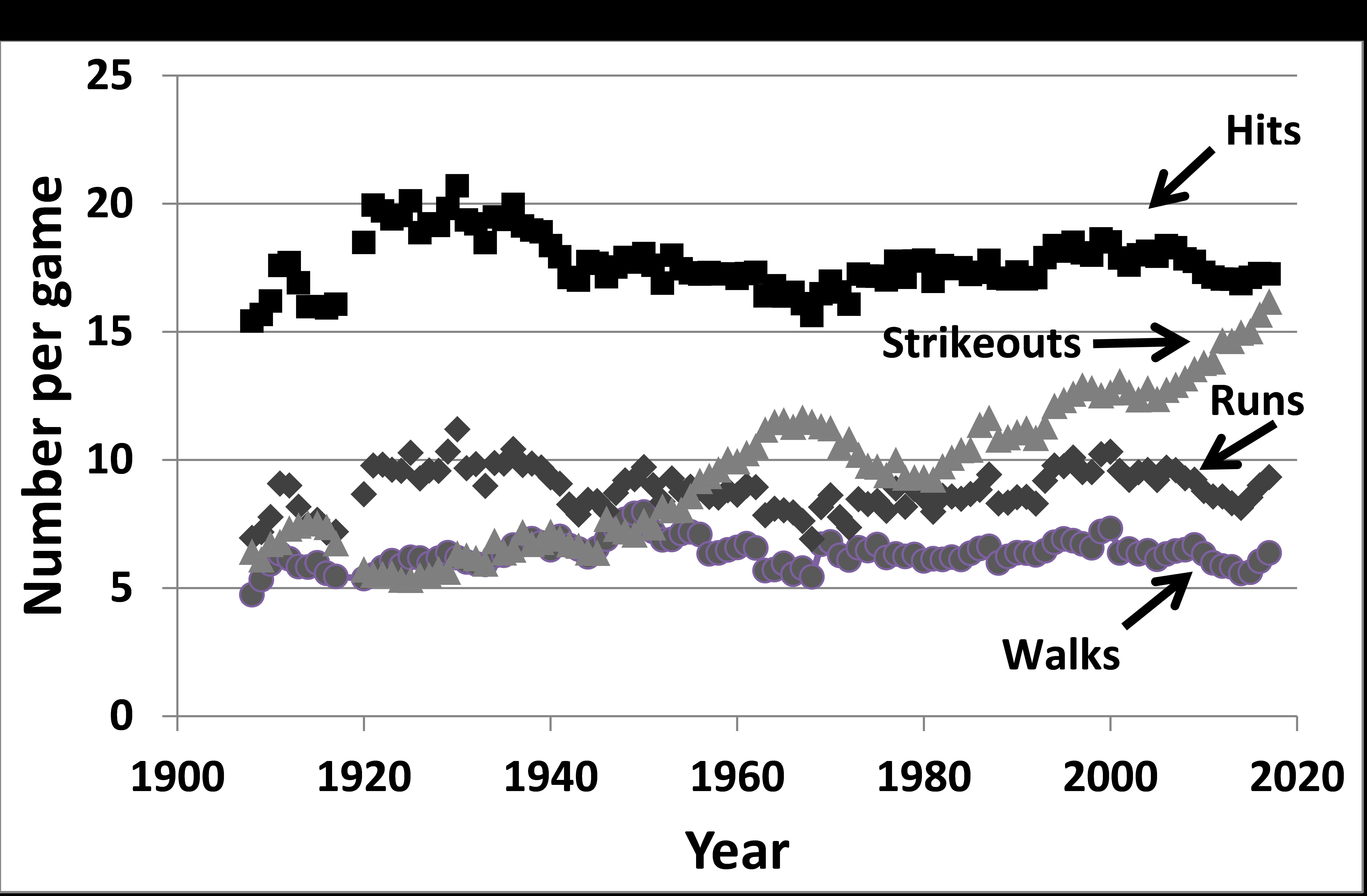
Runs are, of course, the net result of all offensive action. As we see here, scoring has varied over the last 110 years, but there is no obvious upward trend to match the time of game. We have still not returned to the level of scoring seen in the first 15 years of the lively ball era although the average game length then was more than an hour less than it is now. So more scoring doesn’t give us our answer.
The average number of hits per game and the changes there are pretty close to the pattern for runs, but once again there is no systematic upward trend.
Walks take more pitches than other kinds of events (more details on that in a moment), but they also show little systematic change. On the other hand, strikeouts have changed dramatically. As the lively ball era began, the number of strikeouts per game fell, being less than six per game for both teams combined until 1930. The average stayed in the mid-7 range until 1952 when it began a steady increase to a peak of 11. in 1967. After the mound was lowered and the strike zone reduce in 1969, the average began to drop, reaching 9. in 1981. However, since then there has been a steady rise (with some short-term oscillations) and the value really took off in 2006. The strikeout rate in 2017 was 16.2 per game, the first time it has passed 16.
We must address home runs as well and those annual rates are in Figure 4.
Figure 4. Home runs per regulation-length game, 1908 – 2017, both teams combined.
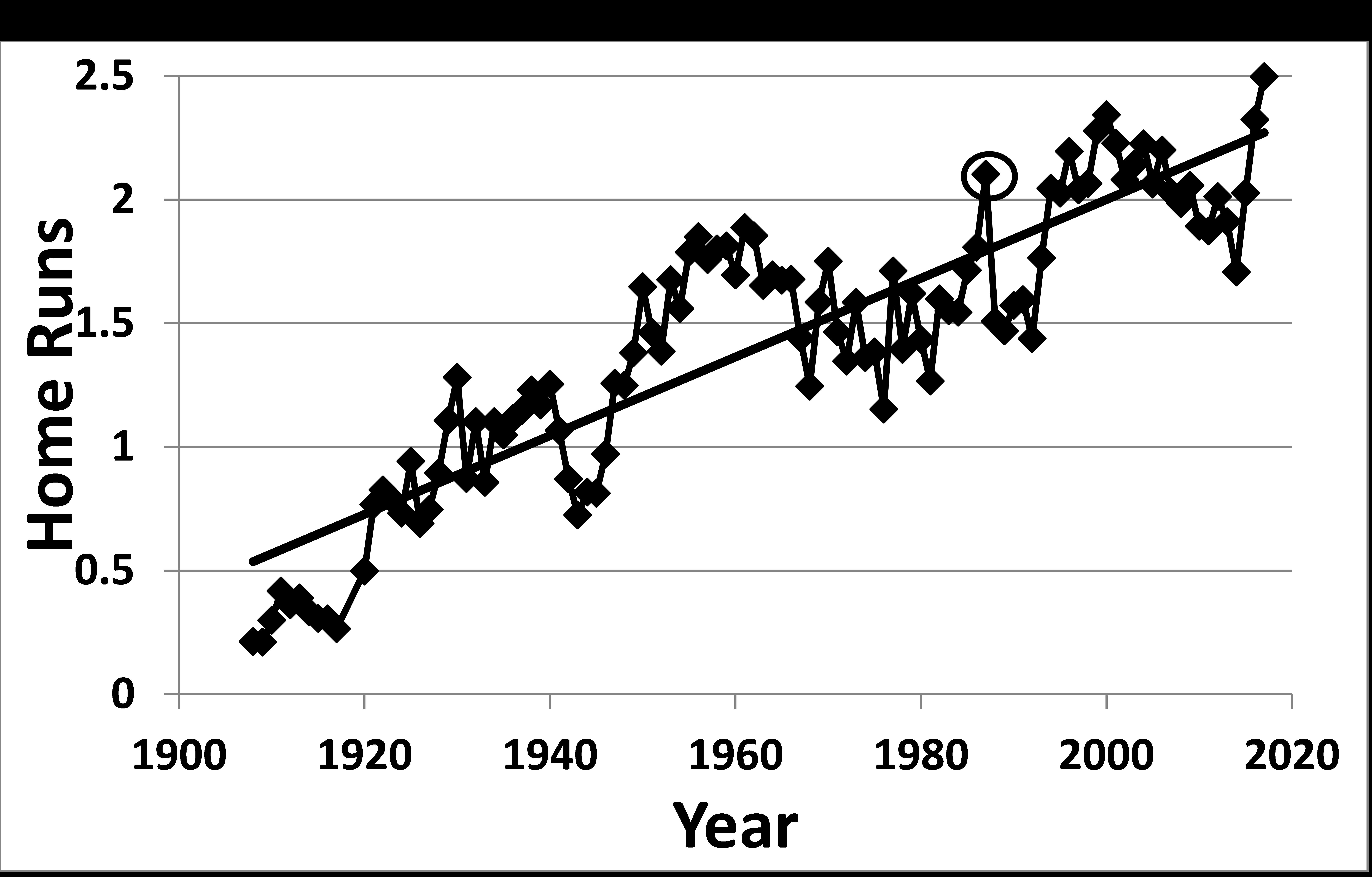
Home runs have certainly increased since 1908, but there have been boom and bust years. As expected, there was a surge with the introduction of the lively ball in 1920, but that ended dramatically in 1940, with a drop of 42% to 0.7 per game in 1943, perhaps reflecting changes in the construction of the ball due to wartime shortages. That slack time was followed by a dramatic upsurge from 1945 to 1961 when it reached 1.9 per game. The next dramatic point was in 1987 (circled in Figure 4) which has been written about a great deal. There is no satisfactory explanation for this 16% spurt in a single year although there was much speculation at the time about a “juiced” ball. Sports Illustrated published a study in which the physical properties of the 1987 ball were studied and nothing was detected to account for this large increase. The decline of 28% the next year is equally mysterious. At any rate, the next sustained increase was from 1992 to 2000, followed by a slow decline to 2014 when it was 1.7. In the four seasons since (2014 to 2017), we have seen an extraordinary 46% increase to last year’s all-time high of just under 2.5 per game. The R2 shows a strong relationship over time.
I go through all this detail to make the point that there is a strong relationship between home run increase and strikeout increase. This is shown clearly in Figure 5.
Figure 5. Home runs and strikeouts, 1908-2017.
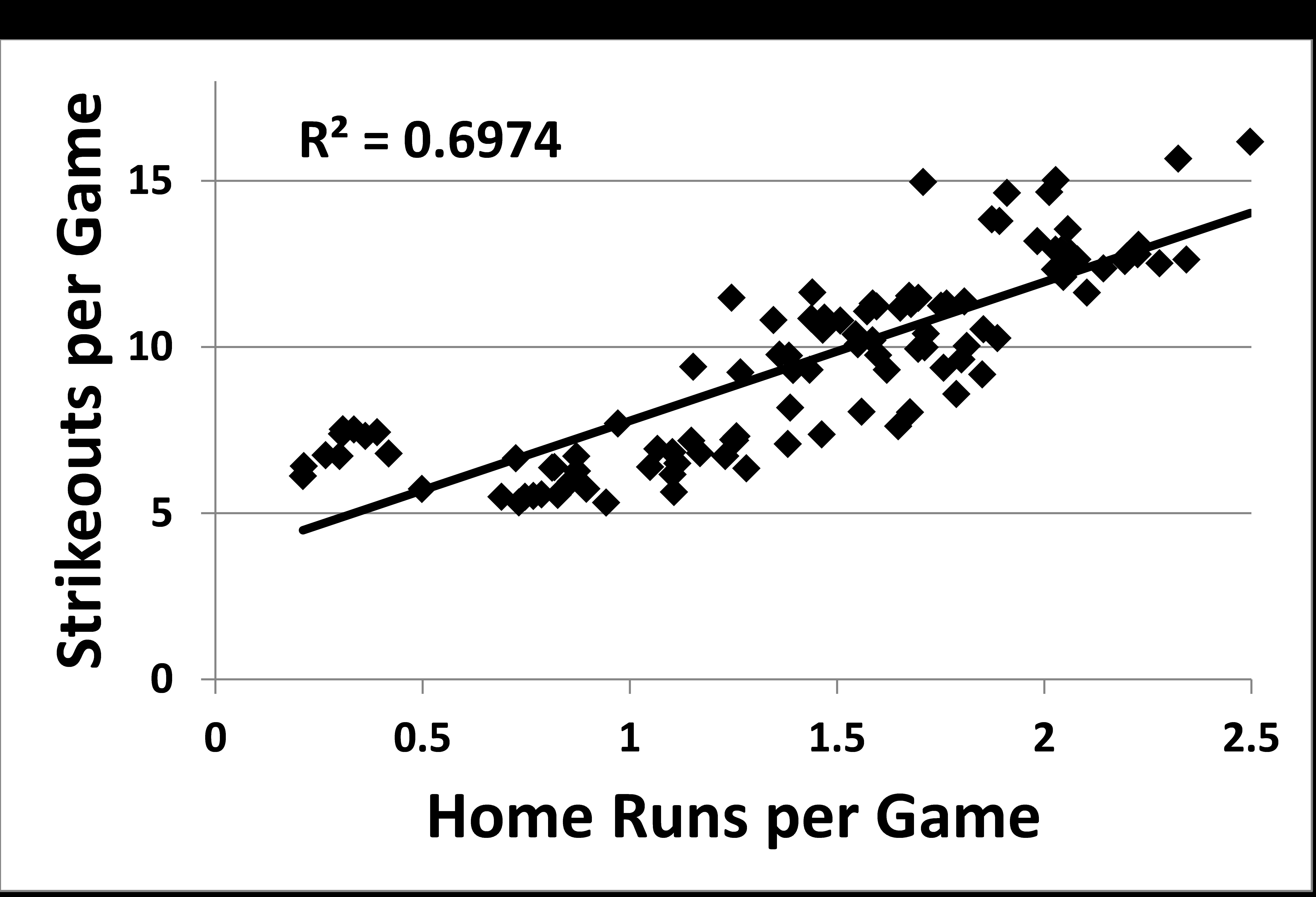
The R2 value of 0.69 shows a strong relation. The only other pair of variables with this close relation are hits and runs. I am led to a conclusion that others have reached as well, namely that the correspondence between home run rate and strikeout rate is one of cause and effect. One consequence of sabermetric analysis has been that strikeouts no longer have the stigma they once did. Statcast data show launch angles and swing velocities and batters have clearly used this information to adjust their swings so that they hit the ball further. Of course, as these harder swings happen, it is much more likely that the ball will be missed, so we have a pretty clear all-or-nothing phenomenon.
I then calculated the average number of pitches for four types of event since 1988, the period for which we have pitch data for every game.
- balls in play
- strikeouts
- walks
- and hit by pitch
These are shown in Figure 6.
Figure 6. Number of pitches for each type of event.
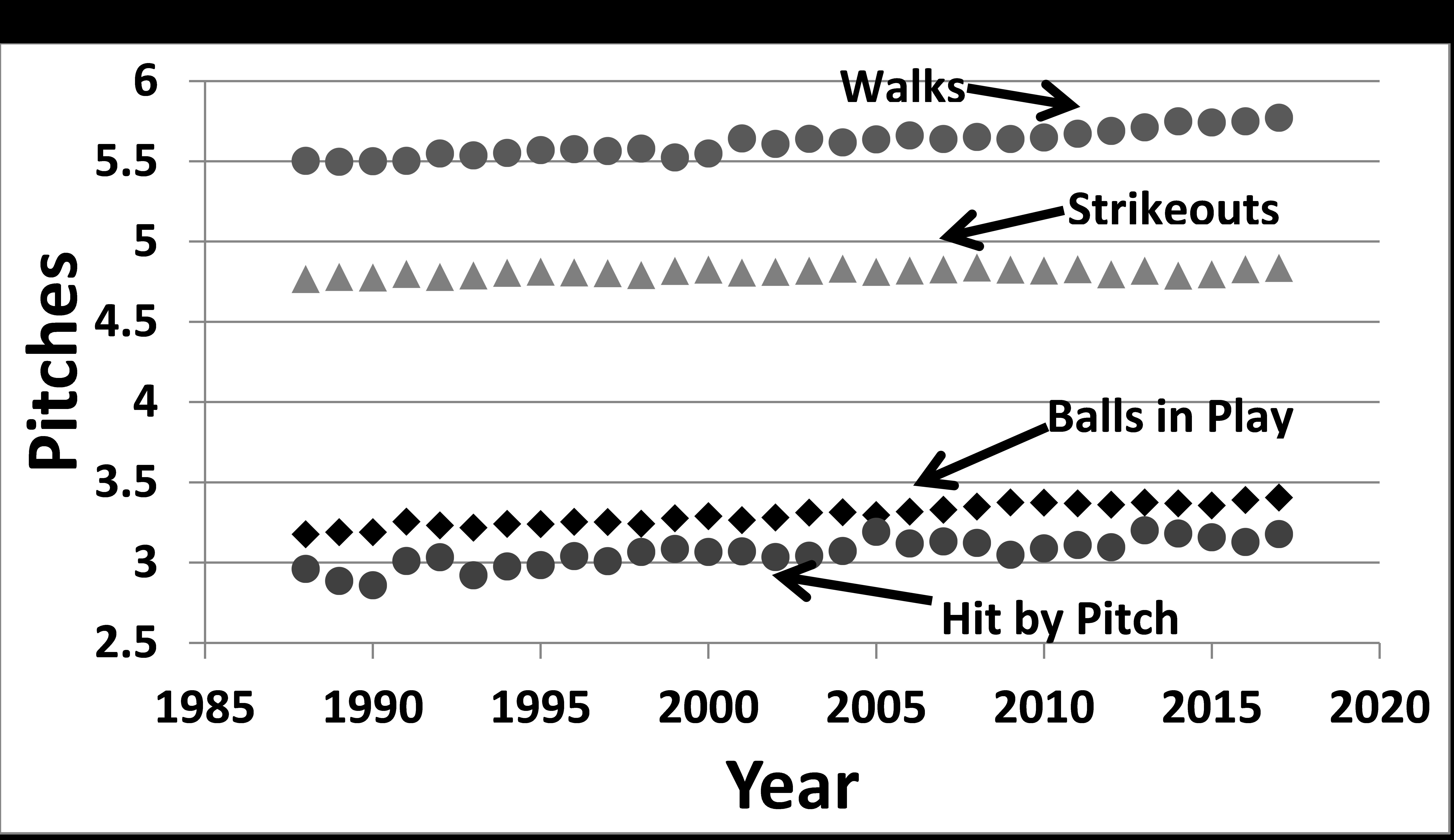
Balls in play, walks, and hit by pitch show a slight, but discernible increase with the average walk now taking 5.8 pitches to complete. These increases, especially in walks, may indicate greater patience on the part of hitters or greater concern (“nibbling”) by pitchers. Strikeouts have not had a comparable increase in the average number of pitches, showing a remarkably stable pattern.
One last way to look at this is to examine how often each type of event occurs. Figure 7 has these results, again from 1988 to 2017. This time outs on balls in play are separated from hits.
Figure 7. Percentage of different events, 1988 to 2017
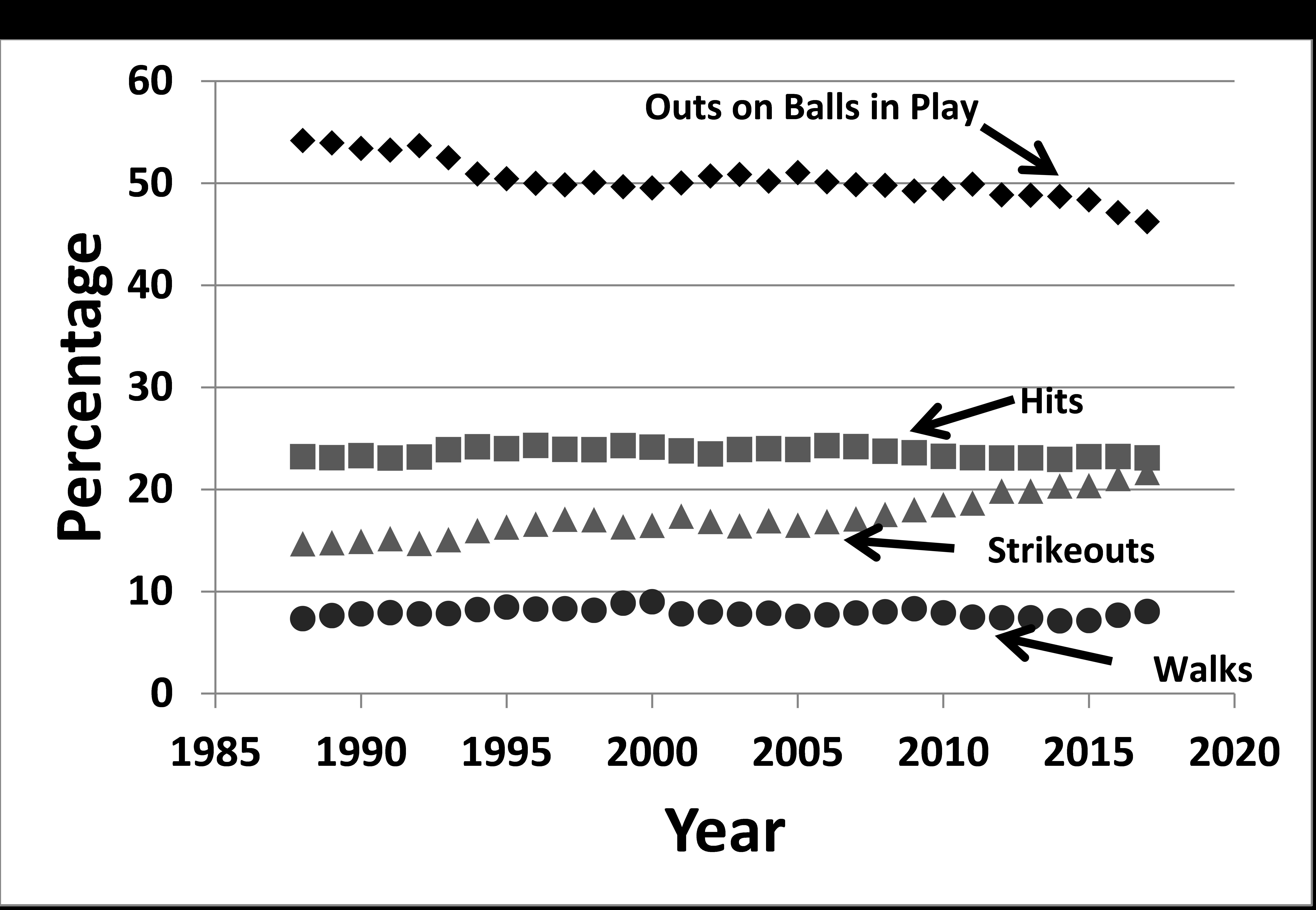
There a clear inverse relation between outs on balls in play and strikeouts. Hits, walks, and hit by pitch have stayed quite steady. On average, strikeouts take 1.5 pitches more than other kinds of out, so this trade of strikeouts for outs on balls in play will also add time to the game. In fact, all of the factors point in the same direction of contributing to increasing game length.
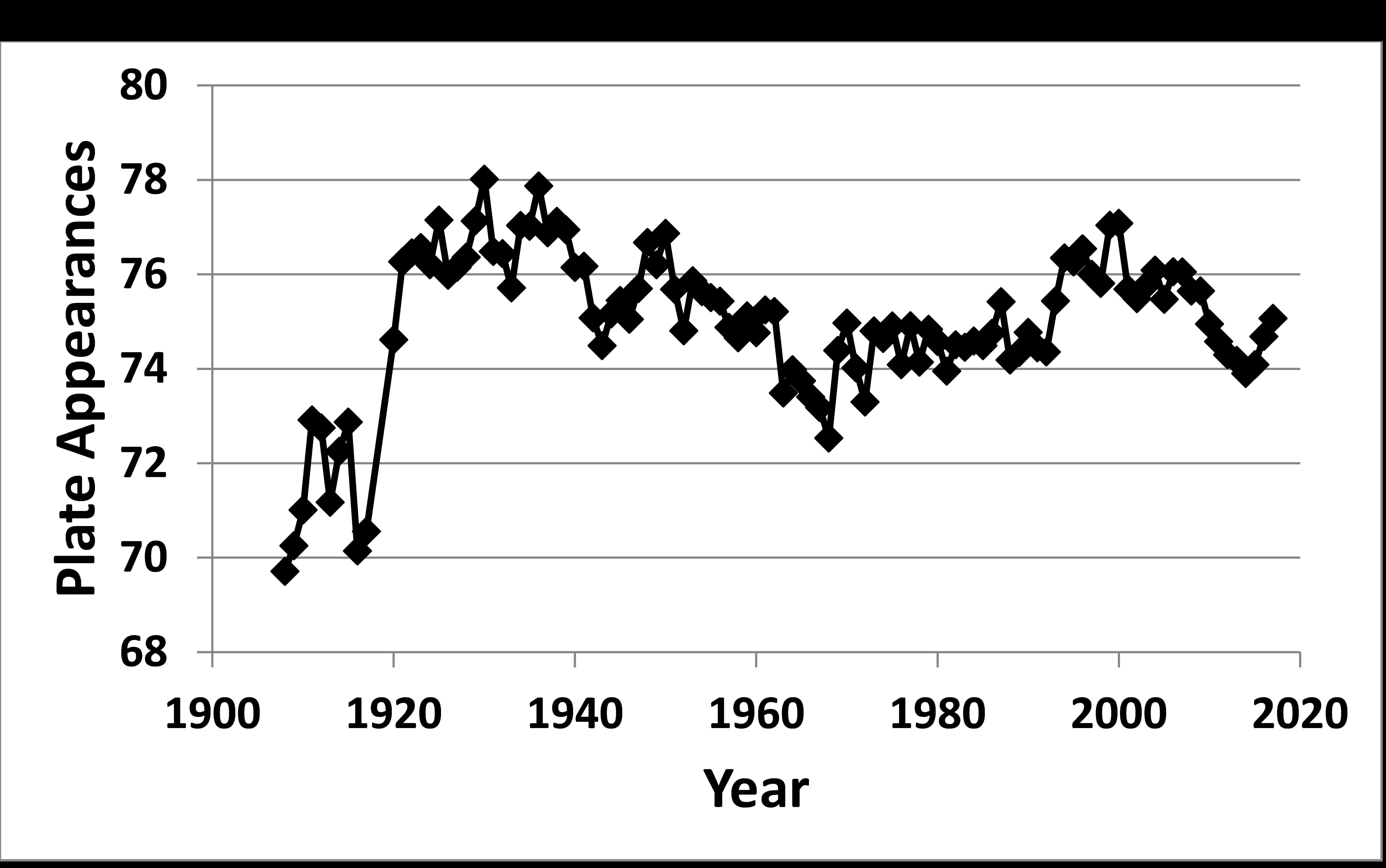
Another important measurement is the number of plate appearances per game and their pattern of change, shown in Figure 8. This is to be expected since the scoring of more runs necessarily requires more plate appearances. This pattern is rather similar to what we saw for scoring, which is reasonable since games with more runs will of necessity have more batters. The rapid increase in plate appearances as the lively ball was introduced and the decline with the higher mound and larger strike zone in the mid-1960s stand out, as did the changes in runs scored. The recent decline and subsequent rise also parallel scoring.
Figure 8. Plate Appearances per Game.
Finally we must consider actions affecting game length which are not directly related to the actual playing of the game. Many of these have been blamed for lengthening game times. My choices for these are as follows:
- Time between pitches (attributable to both batter and pitcher)
- Time between innings
- Replay reviews
- Visits to the mound
- Relief pitchers, especially mid-inning changes
Time between pitches has received attention from several sources in recent years. Baseball Prospectus has documented differences in pitch interval between bases empty situations and those with runners on base. Jim Albert has used PitchFX data very impressively to demonstrate among other thing that intervals are longer in the later stages of the game. Fangraphs published overall data on the time between pitches for all games since 2008.3 These results are especially interesting to me. They measured an increase in the average time between pitches of 21.6 to 24.7 seconds between 2008 and 2017 with over 40% of the difference happening in 2017. The interval has both increased and decreased over this period. If we apply the full value of 2.6 seconds to the average number of pitches in a regulation game, the conclusion is that this increased interval has added 8 minutes to the average regulation game in these last 10 years. Since the average regulation game has increased by 14.5 minutes in that time, the 8 minutes are a significant part of the increase. Grant Brisbee published an intriguing article at sbnation.com in which he did an extraordinarily detailed analysis of two comparable games, one from 1984, the other from 2014, which were available on YouTube.4 The more recent game was over 30 minutes longer and Brisbee’s biggest conclusion is that he felt it was due to “lollygagging” by both pitchers and batters.
Time between innings is not routinely measured or reported so it is hard to know how long it takes to change sides, especially in earlier seasons. There have been various rules on the timing of these breaks and it is clear that the current limit of two minutes is being enforced more stringently.
Replays have been with us for about a decade now and so far this year they occur about one time for every two games, similar to the rate in 2017. They were somewhat more frequent earlier in the decade. For 2018, these reviews are formally listed through June 30 as taking one minute and 23 seconds, with an average on 59 seconds “on the headset.” This does not count the potential delay of 30 seconds granted to teams to decide if they want to challenge. On the other hand, the replay system has greatly reduced the number of managerial arguments on the field, which will lead to a shorter game. So, although it will be hard to get exact numbers for the time taken by reviews, this is obviously another factor that may make games longer.
Visits to the mound by the catcher, infielder, or someone from the bench (pitching coach or manager) also consume time, but I know of no data that systematically measure the time used by visits. MLB has taken some steps in this regard in 2018 by limiting mound visits to six per game per team. The visits were limited to 30 seconds beginning in 2016, the first restriction of this kind. There was consideration of imposing a 20 second limit between pitches as well this year, but that rule was not adopted.
Relief pitcher usage is potentially the biggest effect on time of game. There are two kinds of relief appearances: those at the start of an inning and those that happen during an inning. It seems reasonable that the mid-inning changes should take more time than a change at the start of an inning which should be virtually identical in terms of time consumed to having the same pitcher stay in the game. Figure 10 has the data for these two aspects of relief pitcher usage.
Figure 9. Average number of relief pitchers per game, both teams combined.>
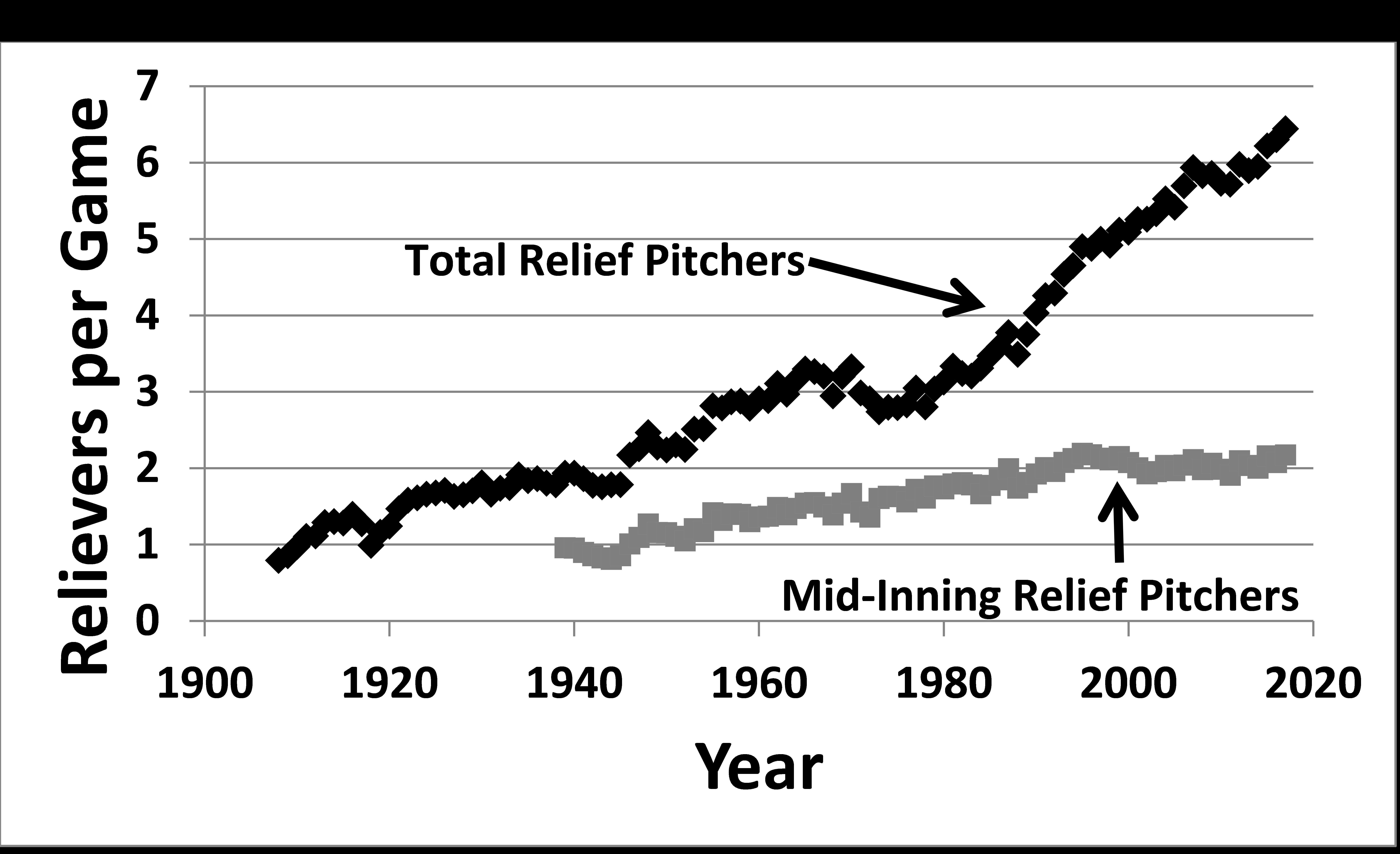
The line for total relievers per game goes back to 1908 because our data allow that determination. The line for mid-inning relievers starts in 1939 because that measurement requires full play by play for every game and Retrosheet’s complete seasons currently begin with 1939.
The line for total relievers has several distinct portions. First, there is a dip during each of the World Wars, although the first drop was bigger. However, there is a fairly steady overall increase from 1908 through 1968 and then a decline for most of the next decade after the changes in mound height and strike zone. The advent of the DH had no immediate effect. From 1975 to the present, we have another long period of increase, much faster than the earlier one. The average passed 6 relievers per game for the first time in 2015 and reached 6.4 in 2017. By the way, through games of June 30, 2018, the average in 2018 is over 6.5, right in line with the recent pace of an additional tenth of a reliever per game for each year.
However, the surprising results to me are the mid-inning changes. These have increased by more than a factor of two since 1939, but essentially not at all since 1994. This indicates to me that the use of additional relief pitchers has had minimal effect on the time of games. These extra pitchers appear to be the “role” players who are dedicated to the seventh, eighth, and ninth innings. Changes in bullpen use are not the culprit for why the game keeps getting longer.
Although there are more batters per game than there were a century ago, the biggest part of the increase is that each plate appearance besides strikeouts takes more pitches than 30 years ago. Perhaps this is a result of the “homer or strikeout” mentality or perhaps it just reflects greater plate discipline by batters in modern times. This conclusion is supported by the data in Figure 10 which covers 1947 to 2018, minus 1965-1987.
Figure 10. Pitches per game
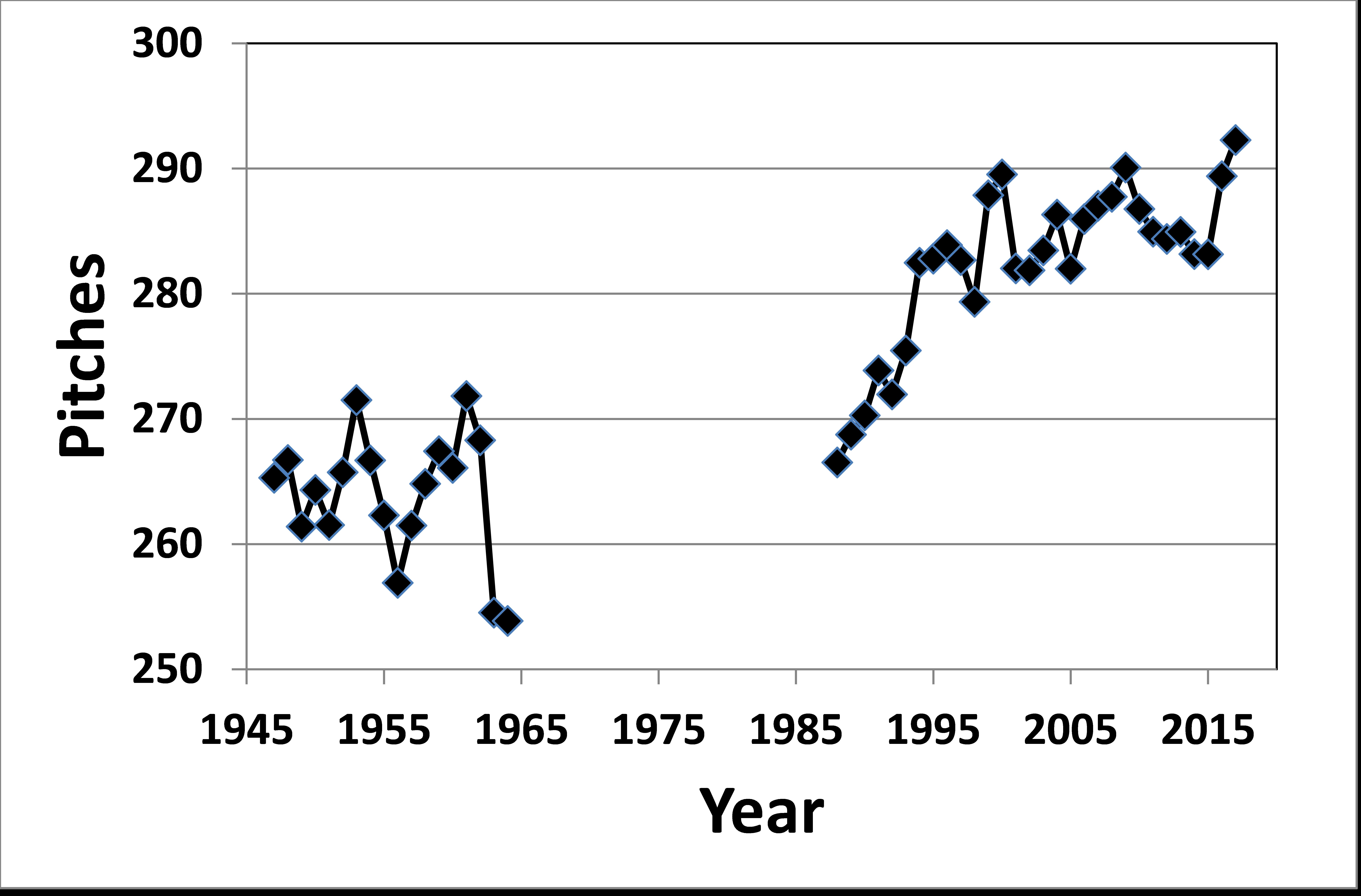
The inclusion of the Allan Roth data reveals interesting patterns.5 The general average for his era is some 25 pitches fewer per game than current levels, but the first few years of the 1988 to 2017 interval are similar to his values. Of course, we do not know the shape of the line for 1965 to 1987, but I note that the last two years that Roth covered, 1963 and 1964, are clearly the lowest of any seasons for which we have data. These were, of course, the first two years of the altered mound and strike zone. My major conclusion is that the single biggest factor contributing to the longer games is the number of pitches. The rise in strikeouts and related drop in outs on balls in play accounts for much of the difference over time. I have identified other factors (and other researchers have as well), but the number of pitches stands out as predominant.
DAVID W. SMITH joined SABR in 1977 and has made research presentations at 22 national SABR conventions. In 2001 at SABR 31, he won the USA Today Sports Weekly Award for his presentation on the 1951 NL pennant race. In 2016 he won the Doug Pappas Award for his presentation on closers. In 2005 he received SABR’s highest honor, the Bob Davids Award, and in 2012 he was honored with the Henry Chadwick Award. He is founder and president of Retrosheet and an Emeritus Professor of Biology at the University of Delaware.
Notes
1 Of the 546 regulation-length game in 1925, 216 were over 120 minutes (40 %) and the average time was 118 minutes.
2 The exclusion of 1918 and 1919 reflects the unavailability of time of game for those two seasons for more than a handful of games. I checked several newspaper sources to no avail. The gap coincides with the demise of the Sporting Life weekly newspaper and the monopoly that resulted for The Sporting News beginning in 1918. The Sporting Life reported time of game faithfully, but The Sporting News did not fill this need until 1920. Most of my analysis will have those two seasons omitted.
3 Fangraphs, search: https://www.fangraphs.com/leaders.aspx?pos=all&stats=bat&lg=all&qual=0&type=22&season=2017&month=0&season1=1871&ind=0&team=0,ss&rost=0&age=0&filter=&players=0&sort=1,d
4 “Season Preview 2017, SB Nation, https://www.sbnation.com/a/mlb-2017-season-preview/game-length
5 I must give proper respect to the first sabermetrician, Allan Roth, whose work with the Dodgers, initially with Branch Rickey, was truly groundbreaking and set the stage for the analytic revolution we currently enjoy.